Website design and development
Startup Homepage Design: The Structure Early-Stage Founders Actually Need
8 min
Posted on:
Updated on:

written by

Stan Murash
Writer
reviewed by

Yarik Nikolenko
Founder
A startup homepage is not there to win a design award. It is there to make a stranger understand your product, trust that you are legitimate, and take the next step. That next step might be booking a demo, joining a waitlist, applying to a program, or simply clicking deeper into the site. But the homepage has to earn that move.
At Tribe, we see this a lot with early-stage teams in AI, SaaS, fintech, Web3, and EdTech: smart founders, real products, decent traction — and a homepage that still reads like a moodboard with commitment issues.
This guide breaks down the homepage structure that actually works for early-stage startups, what to include, what to cut, and where most founders quietly sabotage themselves.
What a Startup Homepage is Supposed to Do
Your homepage has one job: help a new visitor understand the offer fast enough that they do not bounce.
Not admire it. Not “experience the brand.” Not marvel at your transitions. Understand it.
For an early-stage company, that means the homepage should answer three questions almost immediately:
What do you do?
Who is it for?
Why should this person care right now?
This is not just opinionated startup talk. Usability research from Nielsen Norman Group has long emphasized that homepages need to communicate purpose clearly and orient users fast. If people have to decode your positioning before they can evaluate it, you have already made the page harder than it needs to be.
For early-stage startups, the homepage also has a second job: build trust before the visitor knows enough to trust you. That means your structure matters as much as your visuals. The best startup homepage design is usually less about “design style” and more about sequencing the right information in the right order.
Why Most Startup Homepages Underperform
Most weak homepages are not ugly. They are just structurally confused.
They lead with style instead of clarity
A lot of startup teams start with references and visual direction before they have nailed the homepage message. So the page ends up looking polished but saying very little.
That is backwards.
Design should sharpen the message, not distract from the fact that there isn’t one yet.
They bury the call to action
Founders often hesitate to be direct, so the CTA gets softened into vague copy or pushed too far down the page. You end up with a nice-looking hero and no clear next move.
A homepage should not make visitors play detective.
They assume context the visitor does not have
This one is especially common in technical categories. AI startups, developer tools, Web3 platforms, fintech products — all of them tend to write like the reader already understands the category and the jargon.
They do not.
If your first screen says something like “programmable coordination infrastructure for modern teams,” the visitor is not impressed. They are confused.
Startup Homepage Structure That Actually Works
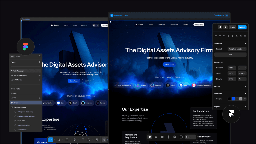
This is the practical part. If you are an early-stage founder, this is the structure to steal.
Hero section
The hero is your first shot at clarity. It needs to state the offer plainly.
What the headline should do
Your headline should communicate the product or service, the audience, and ideally the core outcome.
Examples:
AI interview training for software engineers
Compliance support for Web3 teams raising capital
Developer education programs for blockchain ecosystems
Not poetic. Not mysterious. Useful.
What the hero should include
A solid startup hero usually has:
a clear headline
a supporting subhead
one primary CTA
a simple visual that reinforces the offer
That is enough.
What to avoid
Do not overload the hero with three CTAs, six badges, a long founder essay, and a product diagram that needs subtitles. Above the fold, less is usually better.
Proof section
Once you have said what you do, show why someone should believe you.
This can be:
client or partner logos
traction stats
grants or backing
a short testimonial
recognisable ecosystems or customers
This is where early-stage founders often undersell themselves. If you have shipped for known partners, been funded, launched programs, or supported real users, put it here. Trust signals belong near the top because visitors use them to decide whether the rest of the page is worth reading.
What you actually do
After proof, explain the offer in plain English.
This section is where you move from “here’s the category” to “here’s what this looks like in practice.”
For example:
what the platform helps users do
what the service includes
what problem gets solved
what outcomes are realistic
This is also a natural place to point readers to a broader internal guide like our website design and development guide, especially if they are still figuring out what kind of site they actually need. Tribe’s existing pillar already makes the point that most early-stage startups need a clean, credible, conversion-focused marketing site — not an overbuilt custom monster.
Benefits or use cases
Now show the value from the user’s perspective.
A lot of homepages jump straight from “what we do” to “book a demo.” That skips the bit where the reader decides whether the thing matters to them.
You can structure this as:
key benefits
user outcomes
startup-type use cases
audience segments
This is where homepage design gets strategic. You are not just listing features. You are helping the right visitor recognise themselves.
How it works section
This section is useful because it reduces uncertainty.
People want to know what happens next. A simple three-step explanation often works:
sign up or get in touch
we assess or onboard
you launch, learn, or improve
This is especially important for service businesses, complex SaaS products, and anything that sounds expensive or involved.
Objection handling section
Good homepages answer doubts before they become drop-offs.
Common objections:
is this for someone like me?
will this take forever?
do I need a huge team?
is this too expensive?
do I need custom development?
A short objection-handling section can do a lot of work. For example, Tribe’s own website and service copy repeatedly emphasise speed, senior execution, async collaboration, and not overcomplicating things — because those are the objections founders already have about agencies.
Final CTA section
End with one clear next step.
Not “let’s connect.”
Not “reach out.”
Not “explore possibilities.”
Say what the reader should do:
book a call
request a demo
apply now
join the waitlist
The best final CTAs feel decisive, not salesy. You are removing friction, not performing enthusiasm.
What to Include if You’re Pre-Seed or Seed
A lot of founders think they need a huge homepage with every possible detail. Usually, they do not.
If you are early, the minimum viable homepage is often enough:
a clear hero
trust signals
a short explanation of the offer
key benefits or use cases
one CTA
a simple FAQ
That is a real homepage. It is not “unfinished.” It is focused.
What can wait until later?
deep feature breakdowns
extensive blog promotion
massive comparison tables
seven different audience paths
long founder story sections
overproduced motion for its own sake
This matches how startup websites usually evolve in real life. You do not need the Series B version of your site when you are still validating positioning. Build for the current stage. Expand when the business has earned the complexity.
Common Startup Homepage Mistakes

Writing like a market leader before you are one
Early-stage startups often mimic enterprise messaging. The result is broad, polished, and forgettable.
You do not need to sound bigger. You need to sound clearer.
Showing features before context
Features are useful once the visitor understands the product category and the problem. Before that, they are just nouns in boxes.
Context first. Features second.
Stuffing the page with everything
This usually happens because founders do not want to leave anything out. So the homepage becomes a dumping ground for investor messaging, customer messaging, product screenshots, founder philosophy, FAQs, blog cards, testimonials, pricing hints, and community updates.
Pick the job of the page and structure around it.
Treating homepage design like decoration
This is the big one. A homepage is not there to “feel premium” in the abstract. It is there to explain, qualify, and move people.
That is why homepage structure matters more than visual trends. Trends can help. Structure is what does the heavy lifting.
Homepage Structure By Startup Type
The same structure can flex a bit depending on the company.
SaaS
SaaS homepages usually need more product clarity and stronger feature-to-benefit translation. Screenshots help, but only after the visitor understands what they are looking at.
Web3 And Fintech
These categories need heavier trust signaling. Compliance, security, legitimacy, and ecosystem recognition matter a lot. Visitors are usually scanning for “Is this credible?” before anything else.
That is also why branding for startups is relevant here. In trust-sensitive categories, brand and homepage structure work together. Your design is not just making things pretty — it is reducing suspicion.
EdTech
EdTech homepages often need to balance credibility with accessibility. Visitors want to know what the program is, who it is for, what outcomes are realistic, and why they should trust you with their time or money. This matches Tribe’s ICP expansion into education-focused products and programs, where professionalism matters because people are making meaningful commitments.
FAQ

How long should a startup homepage be?
As long as it needs to be to explain the offer clearly and earn the next click. For most early-stage startups, that means one focused page with 5 to 7 solid sections, not a giant wall of content.
What should be above the fold on a startup homepage?
A clear headline, a short supporting line, one primary CTA, and ideally a simple visual or proof cue. The visitor should understand the offer without scrolling much.
Does every startup need testimonials?
Not necessarily, but every startup needs proof. If you do not have testimonials yet, use partner logos, traction, grants, milestones, founder credibility, or user numbers.
Should the homepage speak to investors or customers?
Usually customers, users, or partners — whoever the primary audience is. If you try to write to everyone, the page gets vague. Investors can still infer quality from a homepage that is clear and credible.
What is the difference between a homepage and a landing page?
A homepage introduces the company and helps visitors orient themselves. A landing page is usually more campaign-specific and focused on a single action. Both need clarity, but the homepage carries more navigation and trust-building responsibility.
Key Takeaways
A startup homepage is a credibility tool first and a design object second.
Clear structure beats clever copy almost every time.
The best homepages answer what you do, who it is for, and why it matters within seconds.
Trust signals should appear early, not as an afterthought near the footer.
Most early-stage startups need a focused homepage, not a bloated one.
Features make sense only after the visitor understands the context.
Strong homepage design is mostly about sequencing information well.
If the page feels vague, the problem is probably structure — not aesthetics.
Good startup homepage design is not about looking expensive. It is about making the right person understand your offer fast, trust you enough to keep going, and feel confident taking the next step.
That is why the best early-stage homepages are usually the clearest ones, not the flashiest.
If your homepage currently feels like a mix of half-formed messaging, nice visuals, and a bit too much optimism, that is fixable. Usually with less, not more.
Book a fit call if you want to get it right.

