Website design and development
How To Spot Dark UX Patterns Before They Wreck Trust
14 min
Posted on:
Updated on:

written by

Stan Murash
Writer
reviewed by
Some product teams call it “conversion optimization.” Users usually call it something else.
Dark UX patterns are design tricks that push people into actions they didn’t really intend to take — subscribing, sharing data, or buying something they might otherwise decline.
They can boost short-term metrics, but they quietly destroy trust, retention, and brand credibility over time.
At Tribe, we see this tension often when founders are trying to balance growth with good product judgment. The teams that win long term usually choose clarity over clever manipulation.
In this guide, we’ll break down what dark UX patterns are, common examples, and how product teams can audit their own design decisions before they turn into trust debt.
Key Takeaways
Dark UX patterns manipulate decisions by hiding information, creating pressure, or making choices difficult to reverse.
They often boost short-term metrics like signups or trial conversions but create long-term trust and retention problems.
Common examples include confirmshaming, fake urgency, hidden fees, preselected options, and difficult cancellation flows.
As regulators increase scrutiny, deceptive interface design is becoming both a legal and reputational risk.
Ethical UX focuses on clarity, transparency, and reversible decisions rather than manipulation.
Simple product audits can help teams detect dark patterns early during design or growth experiments.
In the long run, trust-building design decisions outperform short-term conversion tricks.
What Dark UX Patterns Actually Are
Dark UX patterns (sometimes called deceptive design patterns) are interface decisions intentionally crafted to influence user behavior in ways that benefit the company — often at the expense of the user’s intent or understanding.
The term was originally coined by UX researcher Harry Brignull, who documented how digital products manipulate interface design to push users toward unintended outcomes on the Deceptive Patterns research archive.
These patterns appear across many types of digital products — from SaaS dashboards and ecommerce checkouts to mobile apps. Often they look harmless at first glance: a confusing button hierarchy, a hidden unsubscribe link, or a misleading opt-out message.
But the defining characteristic is intent.
A dark pattern isn’t just poor usability. It’s an interface deliberately designed to guide users toward a specific outcome without full transparency.
Product teams increasingly review these choices during UX audits and design reviews, especially in industries where trust matters. If you want to see how ethical UX decisions fit into broader product thinking, we explore that in our guide to the startup design process.
A plain-English definition
Dark UX patterns are design choices that manipulate user decisions by hiding, confusing, or pressuring choices.
Common tactics include:
urgency
guilt-based copy
misdirection
friction asymmetry
Instead of helping users make informed decisions, the interface quietly steers them toward the outcome the company wants.
Organizations like the Nielsen Norman Group classify these patterns as deceptive experiences because they remove informed user consent.
Dark patterns vs persuasive design
Not every behavioral influence in UX is unethical.
Good product design often nudges users toward better outcomes — such as simplifying onboarding or highlighting safer privacy settings.
This is known as persuasive design, and when done transparently it improves usability.
The difference comes down to clarity and control.
Persuasive UX:
keeps options visible
preserves user autonomy
improves decision clarity
Dark patterns:
hide alternatives
pressure users into choices
make reversing decisions difficult
If you’re designing acquisition funnels or onboarding flows, this line becomes important. We explore that balance further in our article on marketing and design working together.
Why Teams Use Dark UX Patterns in the First Place
If dark UX patterns damage trust, increase churn, and create legal risk, the obvious question is: why do teams keep using them?
The answer is usually less sinister than it seems. Most dark patterns don’t start as deliberate manipulation. They start as metric-driven product decisions that slowly drift away from user clarity.
Growth pressure, aggressive A/B testing, and short-term targets can make a misleading interface look like a smart optimization. A checkout tweak increases conversions. A pre-selected checkbox boosts subscriptions. A harder-to-find cancel button reduces churn.
On paper, the numbers look good.
But those gains often hide long-term costs: lower user trust, support tickets, refund requests, and negative brand perception. Regulators have also started scrutinizing these tactics more closely. The Federal Trade Commission, for example, has published research highlighting how manipulative interface design can mislead consumers and distort decision-making.
Many of these problems emerge when product teams optimize for individual funnel metrics rather than the overall user experience.
This is where strong product design processes matter. When teams review design decisions through a structured framework manipulative patterns tend to surface quickly.
Instead of asking “Does this increase conversions?”, better teams ask a harder question:
“Would a user still make this choice if the interface were perfectly clear?”
That shift alone eliminates most dark UX patterns before they ever reach production.
7 Common Dark UX Patterns to Watch For
Dark UX patterns rarely look dramatic. Most are small interface choices that quietly steer users toward decisions they might not make with full clarity.
Researchers and UX organizations have documented many variations of these patterns, often grouped by how they manipulate attention, pressure, or friction in the interface. Below are some of the most common examples product teams encounter across SaaS, ecommerce, and mobile apps.
Confirmshaming
Confirmshaming uses guilt or embarrassment to push users toward accepting an offer.
Instead of a neutral opt-out like “No thanks,” the decline button might say something like:
“No thanks, I don’t care about saving money.”
This tactic relies on subtle psychological pressure. The interface frames the “correct” decision as socially desirable while making the alternative feel foolish.
UX researchers at the Nielsen Norman Group classify confirmshaming as a manipulative messaging tactic because it interferes with clear decision-making.
For companies trying to build long-term credibility, this kind of copy often does more harm than good.
Roach motel flows
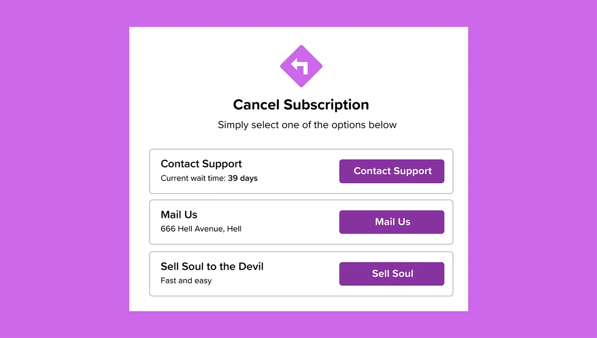
A roach motel pattern makes it extremely easy to enter a system — but difficult to leave it.
Common examples include:
one-click subscription signup
hidden cancellation pages
requiring customer support to cancel
multi-step unsubscribe processes
This tactic appears frequently in subscription products, especially SaaS and media platforms.
Regulators have increasingly challenged these patterns. The Federal Trade Commission has warned companies that cancellation processes must be as easy as enrollment.
Designing reversible decisions is one of the simplest ways to avoid this trap. Many teams address this during UX reviews or product redesigns. If you’re evaluating flows like onboarding or account management, it’s worth reviewing them alongside the broader product structure discussed in our guide to website design and development for startups.
Preselected choices
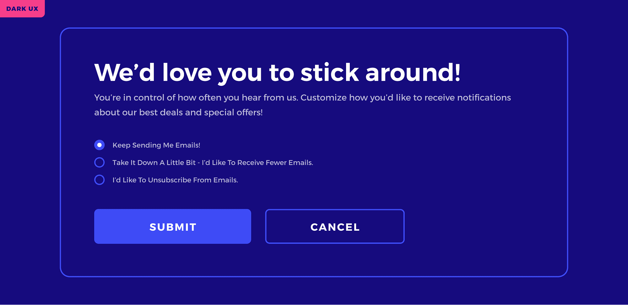
Another common pattern involves preselected options that quietly push users toward upgrades or data sharing.
Examples include:
pre-checked newsletter subscriptions
automatically selected add-ons during checkout
default privacy settings that maximize data collection
Because many users move quickly through forms, these defaults often slip through unnoticed.
From a design perspective, the issue isn’t offering additional options. The problem arises when the interface assumes consent instead of asking for it clearly.
Hidden costs and sneaking
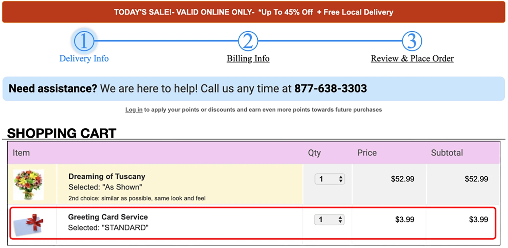
Example from Princeton University's 2019 research "Dark Patterns at Scale: Findings from a Crawl of 11K Shopping Websites."
Some dark UX patterns rely on revealing information too late in the user journey.
Hidden costs typically appear during checkout after the user has already invested time entering details. Shipping fees, service charges, or additional items suddenly appear just before payment.
Another variant — sometimes called sneaking — quietly adds products or services to a cart without clear confirmation.
Both tactics rely on user inertia: once someone reaches the final step of a process, they’re less likely to abandon it.
Product teams focused on sustainable growth increasingly avoid this approach because it damages trust and increases refund rates. Transparent pricing and clear expectations tend to outperform deceptive tactics over time.
Fake urgency and scarcity
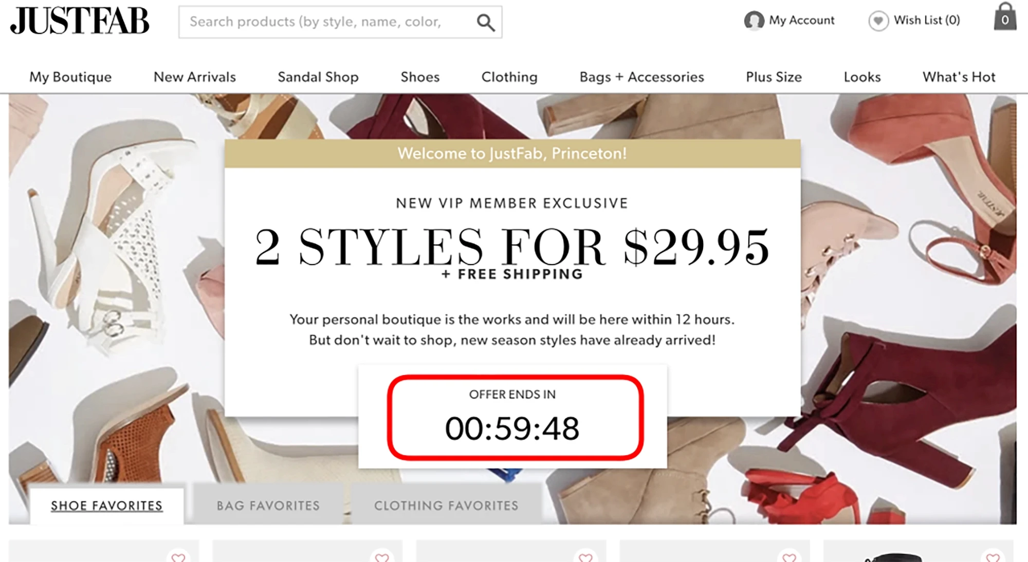
Example from Princeton University's 2019 research "Dark Patterns at Scale: Findings from a Crawl of 11K Shopping Websites."
Fake urgency attempts to pressure users into faster decisions.
Typical examples include:
countdown timers that reset after refresh
“only two seats left” messages that are not real
limited-time offers that never expire
While genuine scarcity can be legitimate — for example, limited event capacity — fabricated urgency undermines credibility once users realize the pressure was artificial.
Research organizations such as the Nielsen Norman Group warn that repeated exposure to these tactics reduces trust in digital interfaces.
Disguised ads and misleading buttons
Some dark patterns manipulate visual hierarchy rather than copy.
Examples include:
advertisements styled to look like product navigation
“download” buttons that lead to ads instead of files
primary buttons that trigger different actions than expected
These patterns exploit familiar UI conventions to redirect user behavior.
The result is often frustration and confusion — especially for users navigating quickly or on mobile devices.
Privacy manipulation
Privacy settings are another area where dark patterns frequently appear.
Interfaces may make accepting tracking easy while hiding the option to decline inside secondary menus. Cookie consent banners often highlight the “accept all” button while making the alternative difficult to find.
European regulators have increasingly scrutinized these designs under digital consumer protection laws. The European Commission has issued guidance warning that misleading consent interfaces may violate consumer and data protection regulations.
For companies building trust-sensitive products — especially in AI, fintech, or education — transparent privacy controls are quickly becoming a competitive advantage rather than a compliance burden.
Why Dark UX Patterns Backfire
Dark UX patterns can produce short-term gains — higher click-through rates, more signups, fewer cancellations.
But those gains rarely last.
Over time, deceptive interfaces create a form of trust debt. The more users feel manipulated, the less likely they are to remain loyal to the product. And unlike design tweaks or feature improvements, lost trust is extremely difficult to recover.
Trust is harder to win back than a click is to earn
Many companies adopt dark patterns because they improve a specific metric: signup conversions, subscription starts, or feature adoption.
But users notice manipulation quickly.
When people feel tricked into a decision — subscribing unintentionally, sharing data unknowingly, or struggling to cancel — the experience changes how they perceive the entire product.
This matters even more in industries where credibility is critical: SaaS tools, AI products, fintech apps, and education platforms.
For early-stage companies especially, trust is one of the most valuable assets a product has. Design decisions that damage that trust often undermine the product’s long-term positioning. We discuss this principle more broadly in our guide to branding for startups.
The retention and support cost nobody talks about
Another hidden cost of dark patterns appears after the conversion.
Users who feel pressured into a decision are more likely to:
cancel subscriptions
request refunds
contact support
leave negative reviews
These issues create operational friction that rarely appears in growth dashboards.
Support teams spend time resolving complaints. Finance teams process refunds. Product teams respond to frustrated feedback.
What looked like a successful optimization in a funnel experiment can quietly increase churn and customer acquisition costs.
The legal risk is no longer theoretical
Regulators have started treating deceptive interface design as a consumer protection issue.
The Federal Trade Commission has published reports explaining how dark patterns can manipulate consumer decisions and obscure meaningful consent.
Similarly, the European Commission has warned that misleading interface design — especially around privacy and subscriptions — may violate digital consumer protection rules.
For product teams, the implication is clear: design decisions are no longer just usability choices. They can carry regulatory consequences.
That’s one more reason many companies are shifting toward clearer, more transparent product experiences instead of relying on manipulative interface tactics.
How to Audit Your Product or Website for Deceptive UX
Dark UX patterns rarely appear as obvious “bad decisions.” Most slip into products gradually through small optimization experiments, copy tweaks, or growth-focused UI changes.
That’s why the best way to catch them isn’t waiting for complaints — it’s running a simple product audit before these patterns reach production.
A good audit doesn’t require legal teams or formal compliance frameworks. It simply forces product teams to evaluate whether the interface respects user clarity and autonomy.
The five-question test
One practical way to detect dark UX patterns is to review your interface decisions with a small set of questions.
During product reviews or design critiques, ask:
Would a distracted user clearly understand this decision?
Is declining as easy as accepting?
Are we hiding important information like price, data usage, or consequences?
Would we feel comfortable showing this UI publicly?
Does this design improve clarity — or just increase a metric?
If a feature or interface fails several of these questions, there’s a strong chance it’s introducing a manipulative interaction pattern.
UX researchers like the Nielsen Norman Group often emphasize that good user experience reduces friction without removing informed choice.
In other words: better UX should help users decide — not quietly decide for them.
A fast founder-friendly review process
For early-stage startups, dark patterns often emerge because design, growth, and product teams work in isolation.
A quick cross-team review can surface these issues early.
A simple approach looks like this:
Screenshot key flows
Capture onboarding, checkout, subscription settings, and privacy controls.
Review them together
Product, design, and growth should review the flows side-by-side.
Identify asymmetric friction
Look for places where accepting something is easy but declining is difficult.
Check for hidden information
Make sure pricing, consent, and cancellation steps are visible and understandable.
Remove anything you need to justify too hard
If the team spends five minutes defending a UI trick, it’s usually a sign the design should change.
This kind of audit becomes much easier when teams follow a structured design workflow.
In practice, teams that regularly review these decisions tend to build products that are easier to trust — and easier to grow sustainably.
What Ethical, High-Converting UX Looks Like Instead
Avoiding dark UX patterns doesn’t mean abandoning persuasion or growth. It means designing experiences that increase conversion by improving clarity and trust, not by manipulating decisions.
The strongest digital products treat user autonomy as part of the product experience. When users clearly understand what they’re agreeing to — pricing, data use, subscriptions, or feature access — they’re more likely to stay engaged with the product long term.
Many design teams now view transparent UX as a competitive advantage, especially in industries where credibility is essential.
Clarity beats coercion
Interfaces that prioritize clarity consistently outperform manipulative design over time.
Clear pricing pages, honest messaging, and visible opt-out options reduce confusion and help users make confident decisions. This approach often results in slightly lower initial conversions but higher retention and stronger brand trust.
Research from the Nielsen Norman Group repeatedly shows that usability improvements increase user satisfaction and long-term engagement more effectively than deceptive tactics.
For startups building their first product experience, clarity is also one of the fastest ways to establish credibility.
Reversible decisions reduce user anxiety
Users are far more willing to try products when they know decisions are reversible.
That means:
easy cancellations
visible unsubscribe controls
transparent trial terms
clear data permissions
Designing reversible choices removes the pressure that dark patterns rely on. Instead of forcing commitment, the interface communicates confidence: users can leave if the product doesn’t deliver value.
In practice, this often increases product exploration and adoption because users feel safer experimenting with the product.
Trust signals outperform tricks over time
High-performing products rarely depend on manipulative interfaces. Instead, they rely on signals that reinforce legitimacy and reliability.
Examples include:
transparent pricing structures
straightforward onboarding flows
clear privacy controls
visible customer support access
These design choices build trust gradually, which leads to better long-term outcomes than short-lived growth hacks.
Teams that consistently prioritize transparent design often end up building stronger brands and more sustainable growth models — something we explore further in our guide to branding for startups.
In the long run, ethical UX isn’t just a philosophical stance. It’s often the more effective business strategy.
FAQ

What is a dark UX pattern
A dark UX pattern is a design technique that pushes users toward actions they might not choose if the interface were completely clear.
These patterns typically rely on tactics such as hidden information, misleading button hierarchy, guilt-based messaging, or difficult cancellation flows.
The goal is usually to increase a specific metric — signups, purchases, or data sharing — even if users don’t fully understand the decision they’re making.
Research organizations like the Nielsen Norman Group describe these interfaces as deceptive because they remove transparency and informed user choice.
Are dark UX patterns illegal
Not every dark UX pattern is illegal, but many are increasingly scrutinized by regulators.
Consumer protection agencies have started targeting manipulative interface design, especially when it affects subscriptions, payments, or personal data.
For example, the Federal Trade Commission has warned companies that deceptive interface design can mislead consumers and violate consumer protection laws.
European regulators have issued similar warnings around misleading consent flows and subscription traps.
As a result, many product teams now treat dark patterns as both a legal risk and a trust risk.
What is the difference between persuasive UX and manipulative UX
Persuasive UX helps users make decisions while keeping their options clear.
Manipulative UX — often called dark patterns — pushes users toward choices they might not fully understand or intend.
The difference comes down to transparency and control.
Persuasive UX:
makes options clear
explains choices honestly
allows users to reverse decisions easily
Manipulative UX:
hides alternatives
pressures users into accepting something
makes reversing decisions difficult
Good design helps users decide. Dark patterns quietly decide for them.
What are common examples of dark UX patterns
Some of the most common dark UX patterns include:
confirmshaming using guilt-based messaging
subscription flows that make cancellation difficult
preselected checkboxes for upgrades or newsletters
hidden fees revealed late in checkout
fake urgency such as countdown timers that reset
These tactics appear across ecommerce platforms, SaaS dashboards, and mobile apps.
How can startups avoid dark UX patterns without hurting conversion
Startups can avoid dark UX patterns by prioritizing clarity over pressure.
A few simple practices help:
make pricing and consent visible early
keep cancellation and opt-out actions easy to find
avoid misleading urgency or messaging
review product flows regularly with design and product teams
Teams that follow a structured design workflow tend to catch manipulative patterns earlier.
In many cases, transparent interfaces produce stronger retention and trust, which ultimately leads to more sustainable growth.
Final Thoughts
Dark UX patterns can look like clever optimization. But most of these tactics create short-term gains at the expense of long-term trust.
Products that grow sustainably usually take the opposite approach. They prioritize clarity, transparent choices, and interfaces that respect user autonomy. The result is often fewer complaints, stronger retention, and a brand people actually trust.
Feel like you need a second set of eyes on this? Book a fit call and let’s see what we can build together.

