Design process
Startup Design Process: A Guide for Founders Who Need to Move Fast Without Shipping Garbage
19 min
Posted on:
Updated on:

written by
Stan Murash
Writer
reviewed by

Yarik Nikolenko
Founder
You've got three weeks until your investor pitch. Your MVP looks like it's straight out of the 00s, and your landing page is a Figma file that says "HERO TEXT GOES HERE" in 72pt Arial. Maybe, just maybe, you start thinking you should've paid more attention to your design process. But you wanted to do everything fast, and design slows things down, doesn't it?
Here's the thing: design isn't the enemy of speed. Bad design process is. When founders treat design as "something we'll figure out later," they end up rebuilding the same screens four times, confusing users, and looking less credible than they actually are. But when you approach design strategically, even on a tight timeline, it becomes a multiplier for everything else: your fundraising deck lands better, your product makes sense faster, your website doesn't make people wonder if you're a real company.
Our daily work at Tribe is creating great design for founders, and doing it fast. So, let's talk about the startup design process and how to make it as painless as possible.
Key Takeaways
Startup design covers your full visual and functional identity: brand foundations, product UI/UX, website, design systems, and marketing assets. These elements should work together.
Design accelerates trust and credibility early.
Follow a lean design process: Clarify your stage and goal → Get fast direction (skip endless discovery) → Use high-fidelity designs with real content → Build a minimum viable design system → Ship, measure, and iterate.
Match design investment to your stage. Pre-seed needs basic coherence. MVP stage needs functional clarity. Seed and beyond needs consistency and scalability.
Effective collaboration requires clear ownership. Founders own business logic, designers own UX decisions, developers own feasibility. Async workflows (Figma, Slack, Loom) keep momentum high without meeting overload.
Define quality tiers for every deliverable: demo-ready, investor-ready, or public-ready. Match quality to context. Ship fast, improve based on real feedback.
Consider design partners over in-house or traditional agencies early. Freelancers work for bounded projects. In-house designers make sense post-Series A. Startup-focused design partners offer embedded speed without the overhead.
Design is leverage. It multiplies your credibility, clarifies your product, improves fundraising outcomes, and accelerates early traction. When done right, it's one of the few truly defensible advantages you can build quickly.
Why Design Matters Early (Even Before You Feel Ready)
Most founders wait too long to think about design. They're deep in code, chasing product-market fit, convinced that "design can wait until we have users." Then they launch and wonder why nobody takes them seriously.
The truth is, design is a trust accelerator. People judge credibility in seconds. Your website loads, they scan it, and their brain makes a snap decision: "Legit company" or "ignore and move on." You don't get a second chance to make that first impression less sketchy.
This matters especially early. When you have no brand recognition, no customer logos to show off, no TechCrunch coverage, design is doing the heavy lifting. It's the difference between "interesting seed-stage startup" and "side project that might be abandoned next month."
Think of it this way: your website is your first investor meeting. Your UI is your first customer success call. Show up looking like you mean it.
A Lean Startup Design Framework for Real Teams
Most design processes are built for companies with time and budget. Startups have neither.
So, here's how it actually works when you're moving at startup speed.
Step 1. Clarify your stage & goal
Before you design anything, answer one question: what does this design need to accomplish right now?
Are you launching to get early signups? Raising a seed round? Testing an MVP with real users? Trying to hire? Each goal requires different design priorities.
If you're fundraising, your pitch deck and website need to scream "credible investment." If you're launching, your product needs to be usable enough that people don't bounce in confusion. If you're hiring, your careers page better not look like an afterthought.
The design goal shifts with your stage. Trying to design for everything at once is how projects drag on for months.
Step 2. Fast direction, not endless discovery
Startups don't have time for six-week research phases and stakeholder workshops. You need good-enough direction, fast.
This means: one or two conversations to align on audience, goals, and vibe. Maybe a quick competitive scan to see what's working in your space. Then you start designing.
Yes, research is valuable. But early-stage teams often use "research" as procrastination. You can learn more by shipping something and watching real users interact with it than you can from another round of "let's workshop the brand values."
Step 3. High-fidelity from day one
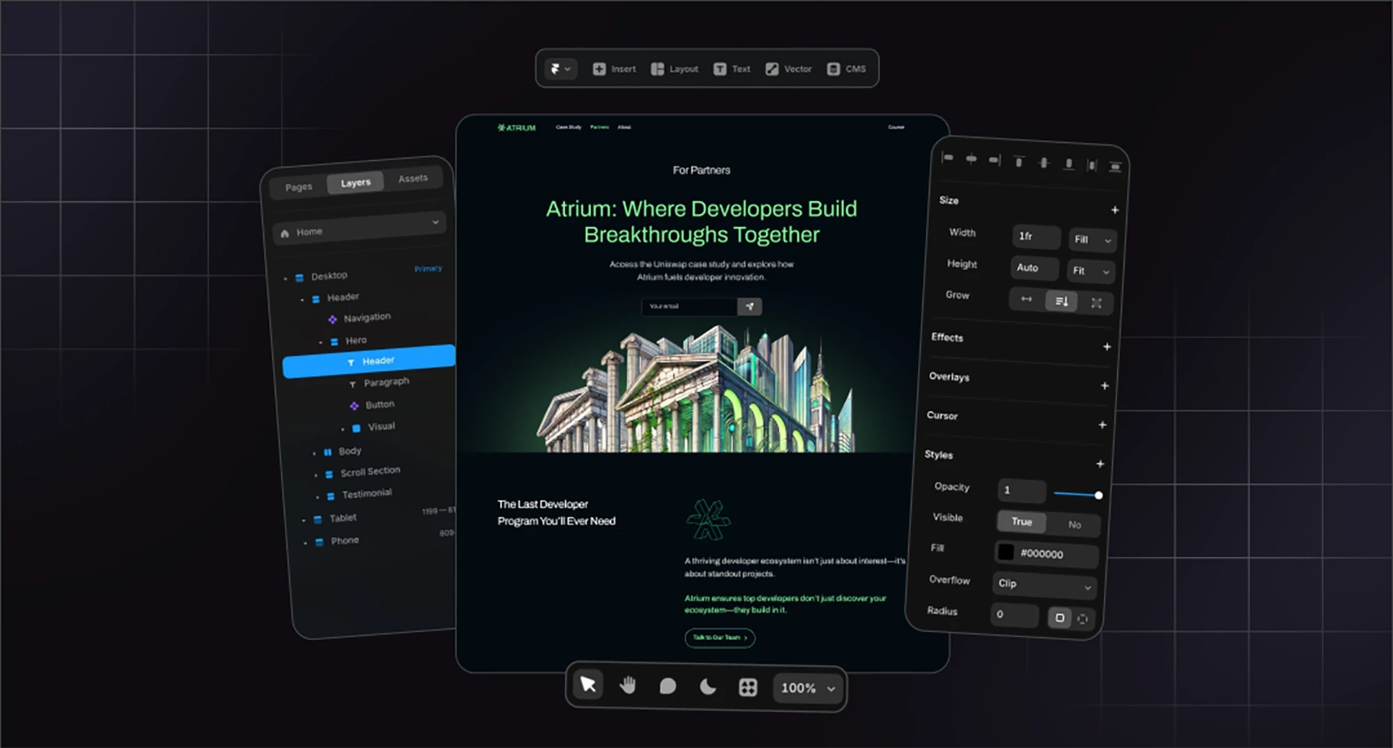
A controversial take, but it's a hill we at Tribe are willing to die on: wireframes slow you down.
Most startup founders don't think in boxes and lines. They think in real content, colors, and buttons. When you show them a low-fidelity wireframe, they can't evaluate if it actually works, they're too busy trying to imagine what it might look like later.
High-fidelity mockups with real content let you make real decisions. You see how your actual messaging fits. You spot problems early. You avoid the "wait, this doesn't work with our content" disaster that happens when you design with lorem ipsum.
This is how we work at Tribe: we skip the wireframe forest and go straight to designs that feel real.
Step 4. Build a minimum viable design system
You don't need a 47-page Figma library on day one. But you do need some basic rules so your product doesn't look like five different designs in a trenchcoat.
Start with the essentials:
Colors. Primary brand color, a neutral palette, maybe one accent. That's it.
Typography. One or two fonts. Define sizes for headings, body, UI.
Spacing. A simple scale (8px, 16px, 24px, 32px) keeps things aligned.
Components. Buttons, form fields, cards and other stuff you'll use everywhere.
What to systematize now vs later? Systematize what you're using repeatedly. If you've only designed two screens, you don't need a full design system yet. Build it as you go.
Inconsistency harms you when users notice. If your homepage uses different buttons than your product, that's a problem. If your internal admin panel has a different font? Nobody cares yet.
Step 5. Ship, measure, iterate
Design isn't a one-and-done deliverable. It's an ongoing feedback loop.
Ship something. See how real people use it. Notice where they get confused, where they drop off, what works better than you expected. Then iterate.
This is where founders get stuck: they keep polishing, convinced it's not "ready" yet. But you learn more from one week of real usage than from three weeks of internal debate.
Know when to pause polishing and start validating. Perfect is the enemy of launched.
What Design Your Startup Needs at Each Stage
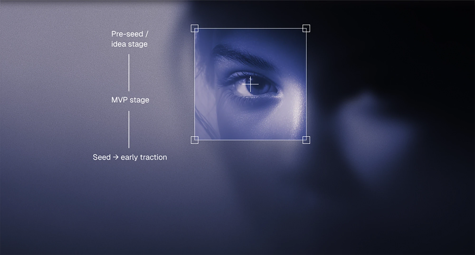
Not every startup needs the same design at the same time. Spending $50K on a rebrand when you're pre-revenue is like buying a tuxedo for a Zoom call. There are some early-stage design best practices to keep in mind.
Pre-seed / idea stage
You're still validating. Maybe you have a prototype, maybe just a pitch deck. You need design that makes you look real enough to have conversations, not design that wins awards.
What you actually need:
A simple startup brand design kit (logo, 2-3 colors, one font)
A landing page that explains what you're building
Basic UI for demos (if you're showing product)
A pitch deck that a bit more customized than Google Slides
What you don't need: full design system, brand guidelines, professional photoshoots, elaborate illustrations.
Goal: coherence. You want people to think "okay, they're serious" not "wow, what a beautiful brand."
MVP stage
You're building the actual product. Early users are testing it. MVP design principles are: you need a design that's functional and credible, but still iterating fast.
What you actually need:
An MVP UI/UX design means core product flows and screens are designed properly
A starter design system (so new features don't look random)
A more polished visual identity that works across product and marketing
Website that reflects you're a real company with traction
What you don't need: pixel-perfect details, extensive user research, marketing site with 15 pages.
Goal: users should be able to navigate your product without getting lost. Investors should see a company that can execute. For a lot of startups, this is where you might want to hire startup design experts, as you need quality and fast. In case that's your case, we at Tribe provide MVP design services, and we're good at it. Just saying.
Seed → early traction
You have users. Maybe revenue (congrats!). You're hiring. Your design is now actively representing your company at scale, and the gaps are starting to show.
What you actually need:
UX refinement based on real user data
Startup website design that reflects your current stage
Cohesive brand across all touchpoints
Marketing collateral that looks professional (one-pagers, case studies, social templates)
Design system that scales with your team
What you don't need: complete rebrand (unless your current brand is actively hurting you), enterprise-level design ops.
Goal: consistency and credibility. When someone moves from your website to your product to your pitch deck, it should feel like the same company. This is also when thinking about your overall startup branding strategy becomes critical.
Designer–Founder Collaboration
Most startup design projects go sideways not because the designer is bad or the founder is demanding, but because nobody figured out how to work together efficiently.
Good collaboration is about clear workflows, fast feedback, and knowing who decides what.
Async design workflows that keep momentum
Startups move fast. Designers need focused time. The solution? Work asynchronously as much as possible.
Tools that actually work:
Figma for design files (with comments for feedback)
Slack for quick questions and updates
Loom for explaining complex feedback without a meeting
Linear or Notion for tracking what's in progress
(That's the stack we use at Tribe, so it's an actual workable list.)
How to give fast, actionable feedback
Don't say "I don't like this." Say "The headline feels too aggressive for our audience, can we try something friendlier?"
Don't say "Can you explore some options?" Say "Can you show me two variations: one bold, one minimal?"
Specificity speeds everything up. Vague feedback leads to guessing, which leads to rework, which kills momentum.
How to structure requests
Give context (what is this for?), constraints (launch date, technical limits), and examples (show 2-3 references of things you like). The more clarity upfront, the fewer revision rounds later.
How designers collaborating with developers work
If you're building product, your designer and developer need to be on the same page. Otherwise you get designs that look great but are impossible to build, or implementations that technically work but look nothing like the mockups.
What good handoff looks like:
Dev-ready Figma files with clear naming, organized layers, and specs
Component documentation (how buttons behave, what states exist)
Shared understanding of what's flexible vs what's fixed
Avoiding design debt
Design debt is when you ship something "temporary" that becomes permanent because nobody has time to go back and fix it. Prevent this by designing with constraints in mind from the start. If your developer says "that animation will take two weeks," maybe you don't need that animation right now.
How to avoid "design by committee"
The fastest way to kill good design? Let everyone have equal input.
Clear decision-making roles prevent chaos:
Founder: business logic, strategy, what success looks like
Designer: UX decisions, visual direction, information hierarchy
Developer: technical feasibility, performance tradeoffs
Everyone gets input. Not everyone gets a vote.
If your team is debating button colors for 45 minutes, you don't have a design problem, you have a decision-making problem. Assign one person (usually founder or designer) as the final call on design decisions, and keep moving.
Balancing Speed vs Quality in Startup Design: How to Decide What's "Good Enough"

Every founder faces this tension: ship it now or make it better first? The answer isn't always "ship fast" and it isn't always "make it perfect." It depends on what you're shipping and who's going to see it.
Here's a framework that actually helps.
Define three quality tiers:
Demo-ready. Internal testing, early feedback sessions, showing to friendly users (mostly, to be honest, your actual friends and relatives) who already believe in you. This needs to work but doesn't need to be polished. Rough edges are fine. Placeholder copy is fine. Just make sure nothing breaks and the core value is clear.
Investor-ready. Pitch meetings, grant applications, anyone evaluating whether to give you money or credibility. This needs to look professional and intentional. No lorem ipsum, no broken links, no "we'll fix that later" disclaimers. You get one shot at a first impression here.
Public-ready. Launch day, press coverage, cold traffic from people who don't know you yet. This is where polish matters. Smooth interactions, cohesive branding, clear messaging. You're competing with every other tab open in someone's browser.
What to polish vs what to skip:
When visual polish matters: first-touch marketing design (your homepage, your demo video, your pitch deck). Anything that affects whether someone trusts you enough to continue.
When clarity beats aesthetics: product flows where users need to accomplish a task. A slightly ugly interface that makes sense is infinitely better than a gorgeous interface that confuses people. Function first, then form.
When to optimize the system vs shipping the next flow: if you're building your third feature and every screen still feels different, pause and systematize. But if you're building your first feature? Just ship it. You don't need a design system for two screens.
Founder questions you might have:
And yes, we lifted them straight off the forums because we do have an answer.
"Should I worry about global styles yet?" If you have more than 5 screens and they're starting to look inconsistent, yes. If you have 2 screens, no. Build the system when the inconsistency starts hurting you, not before.
"How do I prioritize features when everything feels urgent?" Design the ones that unblock revenue or learning first. Everything else can wait.
"How do I avoid shipping ugly UX?" Define "ugly." If it's aesthetically rough but functionally clear, ship it. If it's confusing users, fix it first. Ugly-but-usable beats pretty-but-broken every time.
The real question isn't "is this perfect?" It's "is this good enough to achieve the specific goal we have right now?"
Hiring a Startup Design Partner
At some point, most founders realize they need help. Maybe you're blocked on credibility. Maybe your co-founder's Figma experiments aren't cutting it anymore. Maybe you just need to stop thinking about design so you can focus on literally anything else.
Here's how to figure out what kind of startup design services you actually need.
Freelancers | In-house designer | Traditional agencies | Startup-specific agencies | |
|---|---|---|---|---|
Pros | Affordable, flexible, often very fast. Great when you have a specific project (landing page, pitch deck, rebrand) and can articulate exactly what you need. | Fully embedded in your team, deeply understands your product, always available. | Full teams, established processes, usually produce high-quality work. | Fast, high-quality, built for startup timelines. They understand your constraints (budget, speed, changing priorities). Often work embedded with your team but without the overhead of hiring. |
Cons | You're managing the relationship. They're juggling other clients. Quality varies wildly: some freelancers are exceptional, others ghost you after the first payment. | Expensive (salary + equity + benefits). Takes time to hire. If they're your only designer, they're also your design system architect, brand strategist, UI designer, and icon maker, and that's a lot for one person. | Slow. Expensive. Often built for enterprise clients with long timelines and big budgets. They'll want 6 weeks of discovery before showing you anything. | Fewer of them exist. The good ones are usually booked. |
When effective | You have a clear, bounded project. You or someone on your team can give fast feedback and make decisions. You don't need ongoing support after delivery. | Becomes cost-effective at series A or later, when you have steady design needs every week and enough budget to support a full-time role. Pre-seed companies hiring in-house designers usually regret it unless that person is also a co-founder. | Work well when you're post-Series A, have $100K+ to spend, and need something comprehensive like a full rebrand across 47 touchpoints. | MVP design, rebrands, scaling from prototype to credible product. Basically, the entire early-stage journey. |
Signs you're ready to bring in design help
You're blocked on credibility. Investors or customers are bouncing because your site/product doesn't look serious enough.
You're blocked on product clarity. Users are confused. Your onboarding is a mess. You keep trying to "simplify" it yourself and it's not working.
You're blocked on development. Your engineers are waiting for designs and you're Googling "how to use Figma" at 11pm.
You're stuck doing design yourself. And it's eating time you should be spending on literally anything else.
If any of these sound familiar, it's time. The cost of not getting design right is almost always higher than the cost of hiring help. And, hey, we're literally built for it. Tribe is attuned specifically to startup founders’ needs, that's why we could take Atrium from idea to launched site in 10 days, or help Areta scale a marketplace launch system across 8+ ecosystems in under a month.
Industry-Specific Notes for AI, Web3, SaaS, Fintech, and Edtech Startups

Design isn't one-size-fits-all. What works for a consumer social app doesn't work for a fintech dashboard. Here's what matters most in the industries we see most often.
AI startups
Your product is probably doing something complex under the hood. Your design needs to make that complexity feel simple.
What matters: trust and clarity. Users need to understand what your AI is doing, why they should believe it, and how their data is being used.
Design priorities:
High-signal, low-noise interfaces.
Clean information hierarchy.
Explainability built into the UX (show your work, not just your outputs).
Clarity beats aesthetic hype.
Web3 & crypto
You're fighting skepticism by default. The space is full of scams, rug pulls, and vaporware. Your design needs to communicate legitimacy.
What matters: security, transparency, auditability. Users need to know their funds are safe, what's happening on-chain, and that you're not going to disappear tomorrow.
Design priorities:
Clear onboarding flows for non-crypto-native users (assume they don't know what a wallet is).
Transaction states that reduce anxiety (pending, confirming, complete).
Documentation that actually explains things.
Go for functional, trustworthy, transparent.
SaaS & developer tools
Your users are trying to get work done. Every unnecessary click is friction.
What matters: functional clarity and efficiency. Developers especially have zero patience for marketing-speak or confusing navigation.
Design priorities:
Dashboards that surface the most important information first.
Navigation that makes sense.
Fast load times (developers will notice and judge you).
Documentation and UX working together.
Fintech
You're handling people's money. Every design decision either builds or erodes trust.
What matters: compliance-driven visual clarity. Users need to understand exactly what's happening with their funds, fees, and transactions.
Design priorities:
Reducing cognitive load (financial decisions are already stressful).
Clear calls-to-action.
Transaction histories that are scannable.
Security signals baked into the UI (SSL badges, verification states, encryption indicators).
Error states that actually help people fix problems.
Edtech
You're often dealing with information-heavy interfaces and diverse user skill levels.
What matters: learning flows that don't overwhelm. Users need to scan content quickly and track progress.
Design priorities:
Content-heavy UI that still feels organized.
Clear information architecture.
Progress indicators.
Accessibility (education products should work for everyone).
These are broad strokes, obviously. But if you're building in one of these spaces and your design doesn't account for the specific trust, clarity, or usability expectations of that industry, you're starting with a handicap.
Common Design Mistakes Early-Stage Startups Make
Most startup design failures aren't creative failures, they're process failures. Here are the ones we see over and over, and what to do instead.
Over-designing the brand before proving anything
You spend three months perfecting a brand identity for a product nobody wants yet. The startup logo design has seventeen variations. Then you pivot and it's all useless.
What to do instead: start with a simple, flexible brand kit. Prove the business model first, then invest in brand depth.
Treating templates as design systems
You bought a Webflow template, changed the colors, and called it a day. Now every new page feels like Frankenstein because the template wasn't built for your use case.
What to do instead: templates are fine for speed, but customize them properly or build something that actually fits your needs. A template that's 70% wrong is worse than starting from scratch.
Redesigning too early or too often
Every few months someone decides "we need a refresh." You're burning time and budget.
What to do instead: only redesign when you have a strategic reason (stage change, user feedback, credibility gap).
Letting design happen "whenever someone has time"
No one owns it, so it gets done in random bursts by whoever's least busy. The result: every screen looks different and nothing feels intentional.
What to do instead: assign ownership, even if it's part-time or outsourced.
Mixing 20+ UI styles without noticing
You grabbed components from three different UI kits, your developer built some stuff from scratch, and your marketing site uses a totally different aesthetic than your product.
What to do instead: audit what you have. Pick one direction. Kill everything that doesn't fit.
Creating components before creating flows
You build a beautiful button library and form system before designing a single user flow. Then you realize the components don't actually work for your use cases.
What to do instead: design the flows first. Build components from what you actually need.
Believing they need a perfect brand to launch
You're waiting for the "final" logo, the "right" color palette, the brand guidelines to be complete. Meanwhile, competitors are shipping.
What to do instead: launch with good-enough branding. Iterate based on real-world feedback.
Waiting for "final copy" before beginning design
Design is blocked waiting for copy. Copy is blocked waiting to see the layout. Nothing moves.
What to do instead: design with rough content. Refine copy in context. Iterate together, not sequentially.
FAQ

These are actual questions from search data and founder communities. If you've been Googling any of these at 2am, you're not alone.
What are the 4 P's of a startup?
You've probably seen this referenced in startup frameworks. The 4 P's traditionally refer to Product, Price, Place, and Promotion, borrowed from classic marketing strategy.
How this relates to design: your "Product" needs good UX. Your "Promotion" needs visual assets. "Place" (where you sell/distribute) often means your website and product interface. Design touches all of it. It's not separate from your business model, it's how your business model gets communicated and experienced.
Is it true that 90% of startups fail? How does design affect this?
Yes, roughly 90% of startups fail. Most die from lack of market need, running out of cash, or getting outcompeted.
Design won't save a product nobody wants. But bad design can kill a product people might want. Design doesn't guarantee success, but it removes friction between you and the people who might care.
What is the 50–100–500 rule in startups?
This varies depending on context, but one version refers to company stages: 50 employees (scaling team), 100 employees (structured org), 500 employees (mature company needing systems).
Design implications: at 50 people, you need a real design system or everything starts looking inconsistent. At 100, you probably need in-house design leadership. At 500, you need design ops and governance. Most founders reading this are pre-50, which means you need flexible design that can scale without needing a rebuild every six months.
What are the 5 principles of lean startup design?
Lean startup methodology emphasizes: Build–Measure–Learn cycles, validated learning, MVP development, rapid iteration, and avoiding waste.
Applied to design: start with the minimum viable design that lets you test assumptions. Ship it, measure how users interact, learn what's working, iterate fast. Don't spend three months perfecting a flow no one will use. Design lean, test fast, improve based on real data.
Who can help design an MVP for startup funding?
Depends on your budget and timeline. Freelancers work if you have a clear brief and can manage the relationship. Startup design studios (like Tribe) work if you need someone to take full ownership and move fast. Traditional agencies work if you have enterprise budget and longer timelines.
What's the cheapest way to get decent startup web design?
DIY with Framer or Webflow templates if you have design taste and time. Freelancers if you're willing to vet carefully. Design partners if you want quality without the overhead of hiring full-time.
Don't forget about the reality check. Between cheap, fast, and good, you can only pick two.
How do I design a startup website as a non-designer?
Start with a template from Framer, Webflow, or even Carrd for something ultra-simple. Customize it with your actual content (no lorem ipsum). Keep it clean – less is more when you're not a designer. Use tools like Coolors for color palettes and Google Fonts for typography. Our article on branding for startups has a list of useful tools for founders.
How do I choose a design partner for my tech startup?
Look for speed, portfolio fit (have they worked with startups in your space?), process clarity, and low-overhead collaboration. Ask how fast they can move, who'll actually be doing the work, and how they handle feedback.
Red flags: vague timelines, no clear process, portfolios full of concept work but no real shipped projects, agencies that need six weeks of discovery before showing you anything.
How do I design a logo for a startup?
Honestly? Unless you have design skills, don't try to design your own logo from scratch. Use tools like Looka or Brandmark for AI-generated options ($20–100), hire a freelancer ($500–2,000), or work with a design partner who can build it as part of a larger brand system.
Need help moving fast without shipping garbage? Tribe works with tech startups to handle design and development end-to-end, so you can focus on building your business while we make it look credible. Let's talk.


