Marketing design
Marketing & Design: How to Make Every Asset Work (Harder)
28 min
Posted on:
Updated on:

written by

Stan Murash
Writer
reviewed by

Yarik Nikolenko
Founder
Most startup founders figure out the hard way: you can have the best product in your category, but if your marketing design doesn't work well enough to sell it, people won't get to trying out the product. Unfortunately, in most cases, products don't speak for themselves.
Marketing and design aren't separate functions that occasionally high-five in Slack. They're two sides of the same coin: strategy and execution, message and medium, what you say and how you say it. When they work together well, you get assets that actually convert. When they don't, you get a Pinterest board of "inspiration" that never ships and a founder spending 6 hours in Canva making something that still doesn't look quite right.
Market devils work hard, but Tribe works even harder to make marketing design a competitive edge for our clients. For this guide, we prodded the brains of our designers, gathered specialized forums’ hot takes, and rolled out the text that will help tech startup founders understand what's going on with the two and how to build a system that scales without burning out your team or your budget.
Key Takeaways
Marketing and design are interdependent functions that must work together. Marketing provides strategy and goals; design provides visual execution. Neither works well without the other.
Marketing design includes websites, landing pages, social graphics, email campaigns, pitch decks, ads, and product UI. It's everything customer-facing that supports your marketing goals.
Clarity beats aesthetics every time. If people can't understand what you do in 5 seconds, beautiful design won't save you. Prioritize hierarchy, clear messaging, and obvious calls to action.
Most startups struggle because they force one person to do two jobs. The marketer-designer hybrid role leads to burnout, skill gaps, and inconsistent output. It's usually better to have specialists or partner with an external team.
Build systems, not one-off assets. Create reusable templates and component libraries. This lets you scale design output without scaling headcount.
Start with business goals, not aesthetics. Every design project should answer: What are we trying to accomplish? Who needs to take action? How will we measure success?
Use async communication and high-fidelity designs to move faster. Skip endless meetings and low-fidelity wireframes. Show real work early so feedback happens on actual designs, not abstractions.
Know when to DIY and when to outsource. DIY works pre-revenue with design skills on your team. Outsource when design is limiting growth, you need speed and quality, or the opportunity cost of founder time is too high.
The best agency partnerships feel like having an embedded design team. Low management overhead, fast delivery, proactive problem-solving, and ownership of outcomes, not just deliverables.
Your website, product UI, and marketing materials should feel like one cohesive brand. Use the same visual system across all touchpoints. Inconsistency destroys trust.
What Marketing Design Actually Is, According to People Doing the Work
Let's start with what marketing design actually means, because there's surprising confusion around this.
Go ask five people to define "marketing design" and you'll get five different answers. But here's a practical definition: marketing design is the visual execution of your marketing strategy. It's taking your message, positioning, and goals and translating them into assets that people actually see: websites, landing pages, ads, email campaigns, pitch decks, social graphics, product screenshots, and everything in between.
Here's a framework that helps clarify things:
Brand Design + Marketing Design + Product Design
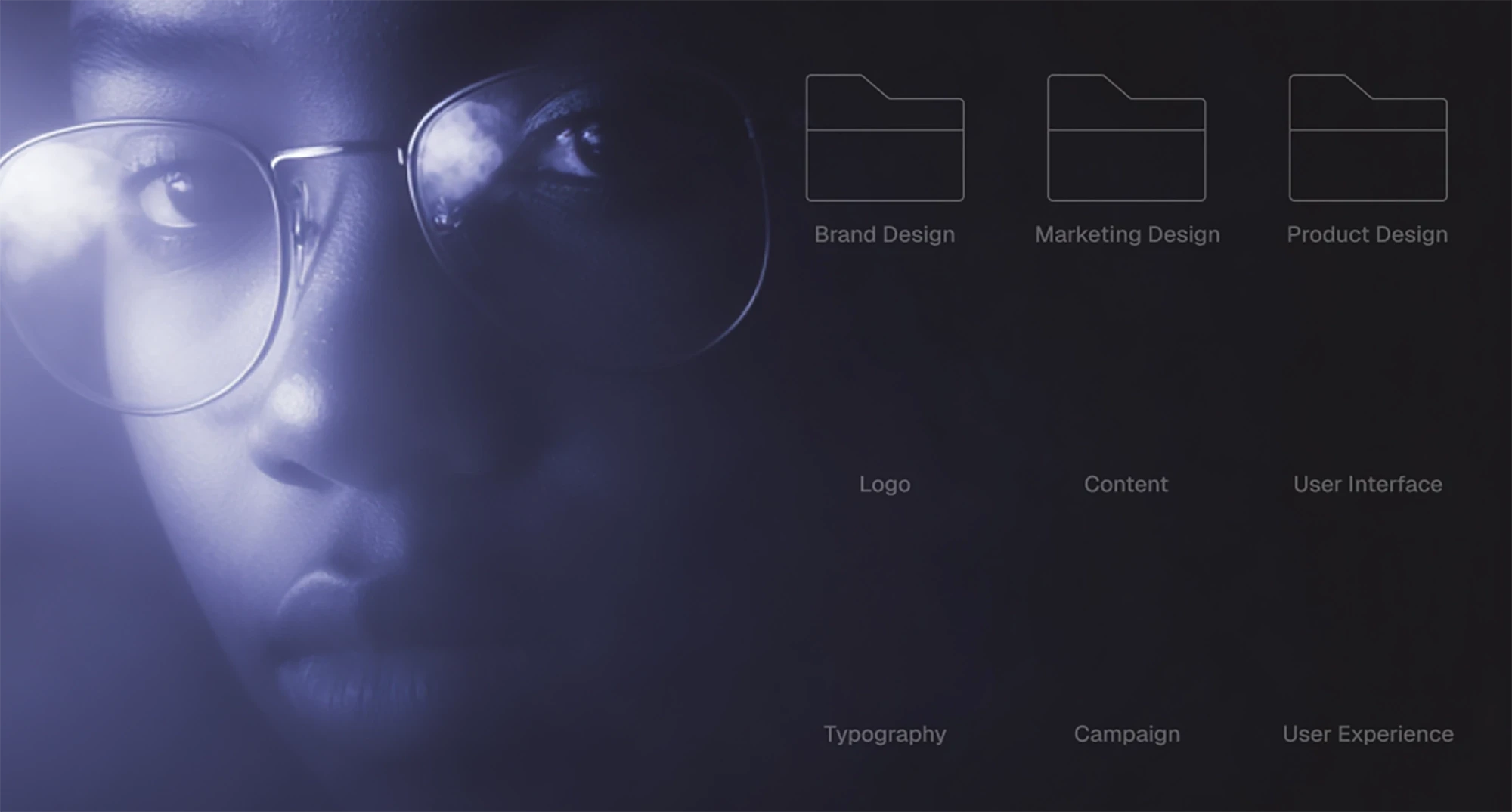
Brand design establishes your visual identity: logo, color palette, typography, the foundational system.
Marketing design takes that identity and applies it to everything customer-facing that lives outside your product: your website, ads, campaigns, content.
Product design focuses on the interface and user experience inside your actual product.
Marketing design sits in the middle. It has to respect brand guidelines while also being flexible enough to support dozens of different use cases across channels. It's where brand meets execution.
What marketing design work actually includes
In practice, marketing design covers a wide range of deliverables:
Digital marketing assets:
Landing pages and website design
Email campaigns and newsletter templates
Social media graphics and templates
Display ads and banner ads
Blog graphics and content visuals
Sales and fundraising materials:
Pitch decks
One-pagers and sales collateral
Case studies and testimonials
Investor materials
Product marketing:
Product screenshots and UI mockups
Feature announcement graphics
In-product marketing (banners, CTAs, empty states)
App store assets
Brand and content:
Infographics and data visualizations
Presentation templates
Branded templates for recurring content
Event graphics and swag design
The common thread? All of these assets exist to support a marketing goal: drive awareness, generate leads, close deals, retain users, build community.
How Marketing and Design Work Together Across the User Journey
Marketing and design don't just "collaborate." When done right, they're integrated from the start. Design isn't decoration you add at the end, it's part of the strategy.
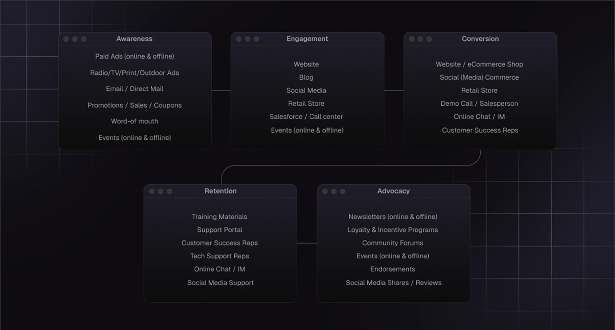
Awareness → Consideration → Conversion → Retention
Here's how they work together at each stage of the user journey:
Awareness stage.
Marketing decides: "We need to reach developers on X (Twitter, if you're old-fashioned enough like me…) and Hacker News."
Design delivers: social cards, blog graphics, and a compelling hero image that stops the scroll.
Consideration stage
Marketing: "Prospects need to understand our differentiation quickly."
Design delivers a landing page with clear visual hierarchy, comparison tables, and trust signals that build credibility in 10 seconds.
Conversion stage
Marketing's take: "We need more demo bookings."
Design gives a conversion-focused page with a single clear CTA, minimal friction, and a form that doesn't feel like homework.
Retention stage
Marketing decides: "We need to keep users engaged with new features."
Design delivers: in-app banners, email campaigns, and product update graphics that feel native to the product experience.
At every stage, marketing provides the "why" and design provides the "how." One without the other is incomplete.
How web design impacts content marketing
Your website is where all your content marketing efforts eventually lead.
You can write the best blog post in your niche, but if readers land on a site that loads slowly, looks outdated, or has no clear next step, they bounce. Web design amplifies (or undermines) every piece of content you create.
Good web design for content marketing means:
Fast load times (because bounce rates kill everything)
Clear information hierarchy (so readers know where to look)
Strategic CTAs (that feel helpful, not pushy)
Readable typography and proper spacing
Mobile optimization (because most traffic is mobile)
Internal linking that keeps people exploring
Why design drives trust (especially in AI/Web3)
In lots of tech categories, such as fintech, SaaS, AI, and Web3, trust is everything. You're often asking people to try something new, invest time learning a platform, or even put money into an ecosystem they don't fully understand yet.
Design signals legitimacy. A polished site tells users: "We're serious, we're credible, we're not going anywhere." A sloppy one tells them: "We're figuring this out as we go, maybe check back in six months."
For Web3 projects especially, where scams are common and skepticism is high, strong design isn't optional. It's the first filter people use to decide if you're legitimate.
The Types of Marketing Design (With Real Startup Examples)
Marketing design is a category that includes dozens of different asset types. Understanding what falls under the umbrella helps you prioritize what you actually need at your stage, and what can wait.
Let's break it down by category, with real examples from startups we've worked with.
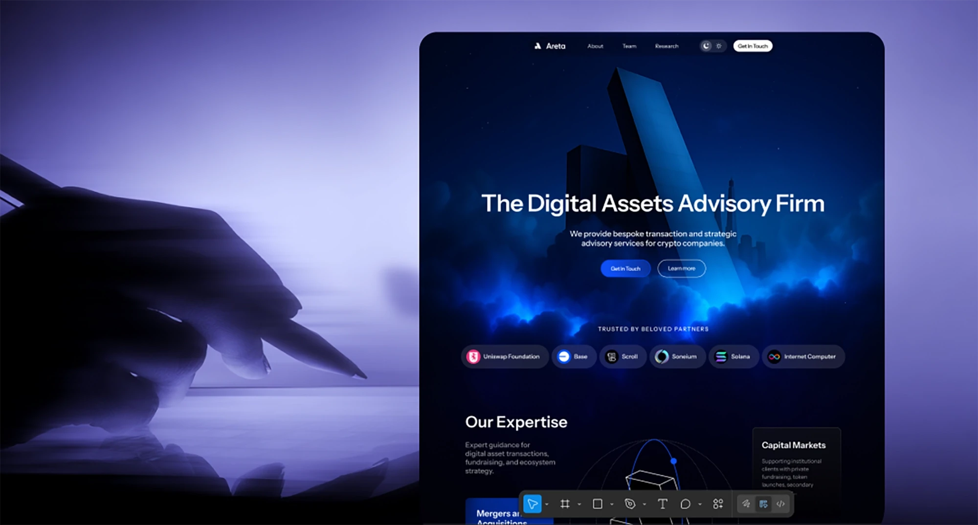
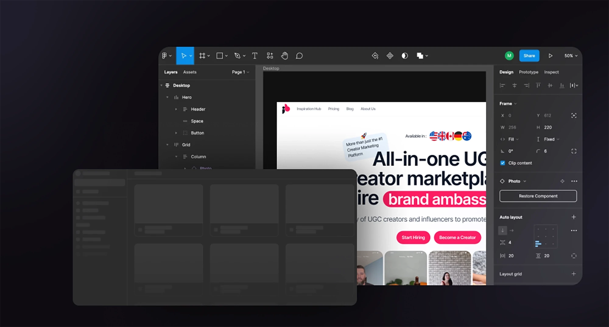
Website & landing pages
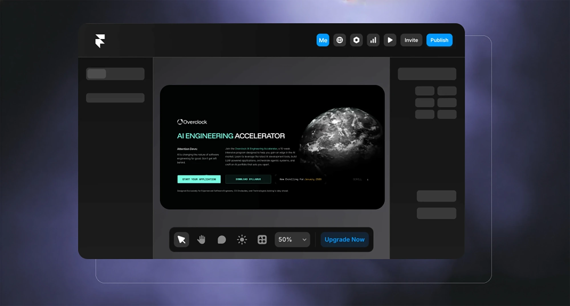
This is often the most visible and highest-impact marketing design work. Your website is where all roads lead. If the site doesn't convert, nothing else matters.
What this includes:
Homepage design
Product/feature pages
Pricing pages
About/team pages
Landing pages for campaigns or launches
Blog design and templates
Product UI + in-product marketing
Here's something most agencies miss: for SaaS products, your UI is part of your marketing. Users spend hours inside your app and seconds on your marketing site.
What this includes:
In-app banners and CTAs
Onboarding flows
Empty states and loading screens
Feature announcement modals
Upgrade prompts
Product tours
This is especially important for product-led growth companies. Your UI needs to guide users toward activation, engagement, and eventually conversion, while maintaining your brand voice and visual identity.
Email marketing design
Email is still one of the highest-ROI marketing channels, but most startup emails look like they were designed in 2012. Template-based email builders give you speed but not differentiation.
What this includes:
Newsletter templates
Drip campaign designs
Product update emails
Transactional email templates
Promotional campaigns
Social media & advertising design
Social is where your brand lives day-to-day. It's also where most startup design falls apart, because social moves fast and teams default to whatever's quickest.
What this includes:
Social media post templates
Ad creative (static and animated)
Cover images and profile assets
Instagram/LinkedIn carousels
Story templates
Video thumbnails
The key to scalable social media design? Templates and systems. Create a handful of flexible layouts that work across platforms, then swap in new content without redesigning from scratch every time.
Marketing collateral (PDFs, pitch decks, one-pagers)
These are the assets you hand to investors, partners, and high-value prospects. They need to look polished, because you're usually competing against companies with bigger budgets.
What this includes:
Pitch decks
Sales one-pagers
Case studies
White papers and reports
Media kits
Partnership proposals
Pitch decks especially matter for early-stage startups. Investors see hundreds of decks. Yours needs to communicate clearly and look credible in the first 10 slides, or you've lost them.
When everything works together
The magic happens when all these asset types feel like they come from the same brand. A prospect sees your LinkedIn ad, clicks through to a landing page, signs up for a demo, receives a confirmation email, and later reviews your pitch deck, and at every touchpoint, the experience feels cohesive.
That's when marketing and design are truly working together.
The Role of Design in Marketing (What Reddit Says That Experts Don't)
If you want to understand what founders and marketers actually struggle with, don't read agency blogs (yes, I know this sounds ironic because we are one. Just roll with it). Read Reddit threads and Quora questions. The raw, unfiltered frustrations there can tell you a lot.
Here's what people are actually saying about the role of design in marketing when they're asking for help:
Clarity > aesthetics
One of the most common themes: "My designer made something beautiful, but no one understands what we do."
Designers love to win awards. Marketers need to drive conversions. These goals don't always align.
Good marketing design prioritizes clarity first. If someone lands on your homepage and can't figure out what you do in 5 seconds, the gradient background and custom illustrations don't matter. You've already lost them.
Hierarchy helps conversions
People don't read websites, they scan them. Good design respects this.
If everything on your page screams for attention (bold headlines! bright CTAs! animated sections!), nothing gets attention. You need contrast. You need a clear path.
What good hierarchy looks like in practice:
One primary CTA per page (not five)
Headlines that tell the story even if you ignore the body copy
Visual weight that guides the eye down the page
Whitespace that lets important elements breathe
Reddit marketers constantly ask: "Why isn't my landing page converting?" The answer is usually: your design isn't doing the work. There's no clear focal point, the CTA is buried, or the value proposition gets lost in a wall of text.
Visuals help people "get it" faster
Text is slow. Visuals are fast.
A well-designed comparison table beats three paragraphs of explanation. A simple diagram beats a bullet list. A screenshot with annotations beats a feature description.
This is especially true for technical products. Developers and technical buyers want to see how things work, not read marketing copy about "innovative solutions" and "cutting-edge technology."
Small teams rely on reusable templates
Here's a truth most design agencies don't want to admit: you don't need custom design for every single asset.
What you need is a system. A handful of flexible templates that can be adapted quickly without starting from scratch every time.
This is the insight that came up constantly in Reddit threads from overwhelmed marketing teams: "I'm the only person doing design and we need to ship 20 social posts a week. Help."
The solution isn't hiring a full-time designer (most early-stage startups can't afford that). It's building a template library. A few solid social post layouts. A pitch deck template you can update with new slides. An email template that works for newsletters and product updates.
Don't Make One Person Do Five Jobs

Let's be realistic: in most startups in best case scenarios either designer is also responsible for marketing or vice versa, or the founder juggles all these roles + sales + finances + god knows what else.
We know, no one has enough money to hire everyone you need, especially at early stages.
You have three relatively low-cost options to break the cycle of sh*tty design, missed deadlines and the global burnout:
1. Build internal systems. If you have someone with design skills, have them create templates and guidelines that others can use. This doesn't solve the skill gap problem, but it helps with consistency.
2. Use template libraries smartly. Tools like Canva Pro, Notion templates, and presentation libraries can help non-designers create decent assets. The key word is "decent" – you're trading polish for speed.
Partner with a design team that works like an extension of your company. This is what we do at Tribe. We're not an agency you manage; we're the design team you don't have to hire. We take full ownership of the visual side while you focus on strategy and execution. Obviously, you can also research our competitors; you do you. It's still an option we prefer to seeing out there in the wild, a poor employee overworked with 2,5 jobs they don't have qualifications for, and producing the design which for us will be painful to look at.
Okay, let's get back to it, because with or without an agency, there's work you'll need to do.
How to Combine Marketing & Design Effectively
Here's a practical playbook combining real-world advice with how we approach this at Tribe.
Start with the business goal (launch, fundraising, feature release)
Design without strategy is decoration. Every design project should start with a clear business outcome.
Before we touch Figma, we ask:
What are you trying to accomplish?
Who needs to take action?
What's the success metric?
Examples of clear goals:
"We're launching our marketplace and need 100 ecosystem partners to see it"
"We're fundraising and need a deck that gets us second meetings"
"We're shipping a new feature and need existing users to try it"
"We need to look credible enough that enterprises take our sales calls seriously"
When the goal is clear, design decisions become obvious. When it's vague ("we need a website refresh"), you end up in endless revision cycles because there's no shared definition of success.
Design brief template
A good design brief prevents 80% of miscommunication and wasted time. Here's what needs to be in it:
Project overview:
What are we building? (landing page, pitch deck, email campaign, etc.)
Why now? (product launch, fundraising, event, rebrand)
What's the deadline? (be realistic but honest about urgency)
Goals & success metrics:
What business outcome does this support?
How will we measure success?
What happens if this doesn't get done or done well?
Audience:
Who is this for? (be specific: "technical founders at seed-stage AI startups" not "entrepreneurs")
What do they care about?
What objections or questions do they have?
Key messages:
What's the one thing people should remember?
What are the 2-3 supporting points?
What's the call to action?
Brand & style guidance:
Existing branding strategy and guidelines (if any)
Visual references (2-3 examples of what you like and why)
What to avoid (equally important)
Logistics:
Who's the decision-maker?
Who gives feedback?
What's the review process?
This doesn't need to be a 10-page document. A well-organized Notion page or Google Doc works fine. The point is alignment before work starts.
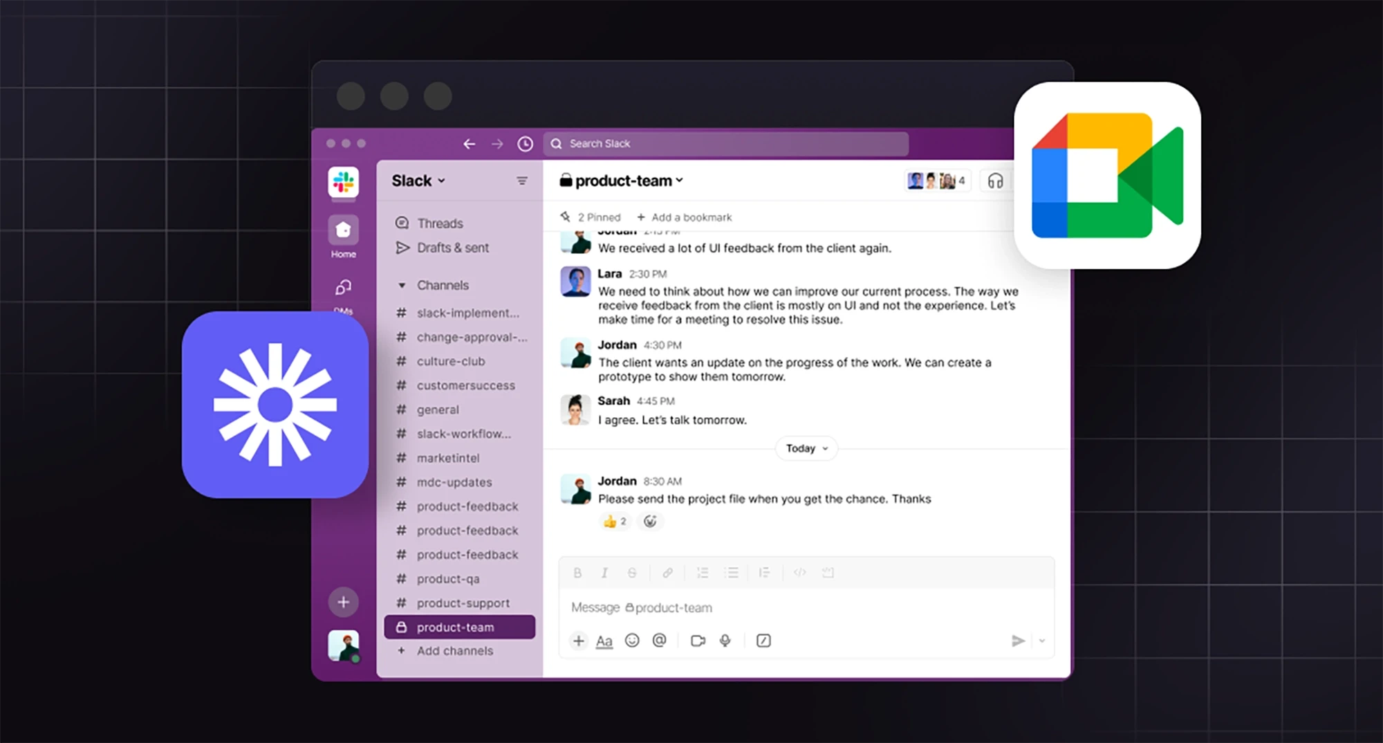
Async communication
Real-time meetings are expensive. For every 1-hour design review call, you're burning at least 2 hours of productivity (the meeting itself plus context switching).
Async communication works better for design collaboration:
Use Slack for:
Quick questions and clarifications
Sharing work-in-progress
Status updates
Fast decisions on small things
Use Loom (or similar) for:
Detailed feedback on designs
Explaining complex ideas
Walking through user flows
Showing instead of describing
Use calls for:
Initial kickoff (to build rapport and align on vision)
Major milestone reviews (when something needs sign-off)
Problem-solving sessions (when async isn't working)
With most of our clients, we have one kickoff call, then work primarily through Slack and Loom until we're ready for a review. This lets us move faster without the overhead of scheduling meetings every time someone has feedback.
Use high-fidelity design early
Some agencies start with wireframes: black and white boxes showing structure without visual design. Then they move to mockups. Then to prototypes.
This made sense when design work was expensive and hard to change. Now? It's often faster to just design the real thing.
We typically skip low-fidelity wireframes and jump straight to high-fidelity designs using real content. Why?
You see the real thing faster.
Fewer translation errors.
Real content reveals real problems.
Momentum stays high.
System > one-off assets
This is the insight that separates teams that scale from teams that stay stuck.
Every time you create something – a landing page, a social post, a pitch deck – ask: "Could this become a template?"
Instead of designing one landing page, design a landing page system:
Reusable hero section with swappable headline/image
Feature block components that can be rearranged
Testimonial layouts that work with different quote lengths
CTA sections that adapt to different goals
Instead of designing one social post, design a template library:
3-5 flexible layouts that work across platforms
Clear rules for when to use each one
Easy-to-update text and image slots
Instead of designing one pitch deck, design a deck system:
Slide templates for different content types (problem, solution, traction, team)
Consistent visual language across slides
Easy-to-update data visualizations
The initial investment is slightly higher (building a system takes more thought than designing once), but the ROI is massive. You ship faster, maintain consistency, and reduce decision fatigue.
A Founder-Friendly System for High-Impact Marketing Design
Most founders approach marketing design reactively: "We need a pitch deck by Friday" or "Can someone make a graphic for this tweet?" (or however they are called now). This leads to chaos, inconsistency, and a backlog of design requests that never gets cleared.
Here's a better way: a lightweight system that helps you prioritize, execute, and maintain quality without needing a full-time design team.
Step 1: Prioritize assets by business impact
Not all design work is created equal. Some assets directly drive revenue or unlock opportunities. Others are nice-to-have.
Tier 1 (Do these first):
Homepage and core product pages
Primary conversion pages (demo request, signup, waitlist)
Pitch deck (if you're fundraising)
Sales collateral (if you're B2B)
These are the assets that appear in critical moments: investor meetings, enterprise sales calls, first-time visitor experiences. If these look bad, you lose credibility instantly.
Tier 2 (Do these when Tier 1 is solid):
About/team page
Case studies or testimonials
Blog design and templates
Email templates
Social media templates
These support growth and build trust over time, but they're not usually the bottleneck preventing you from closing deals or raising capital.
Tier 3 (Do these when you have momentum):
Careers page
Resource library
Press kit
Event assets
Swag and merch
These matter as you scale, but early-stage startups can usually skip them without consequence.
Step 2: Create a minimum viable design system
You don't a 50-page brand book. You need a one-page reference that prevents the most common mistakes.
Your minimum viable design system should include:
1. Logo files
Primary logo (full color, light and dark backgrounds)
Alternate versions (icon-only, horizontal, vertical)
Clear usage rules (minimum size, spacing, what not to do)
2. Color palette
Primary brand color (your main identity color)
Secondary colors (2-3 supporting colors)
Neutral colors (backgrounds, text, borders)
Semantic colors (success, error, warning)
Include hex codes, RGB values, and usage notes
3. Typography
Primary typeface (for headlines and UI)
Secondary typeface (for body copy, if different)
Type scale (H1, H2, H3, body, small text sizes)
Usage examples
4. Core components
Button styles (primary, secondary, ghost)
Form fields
Card layouts
Icon style (outlined vs. filled, stroke weight)
5. Voice and tone examples
3-5 before/after examples showing how you talk vs. how you don't
Key phrases or taglines
Words to use/avoid
Keep this in a Notion page, Google Doc, or Figma file that your whole team can access. Update it as you create new assets, but don't let it become a bureaucratic document that no one reads.
Step 3: How marketing → site → product stay aligned

The most common branding failure at startups? Your marketing site looks like one company, your product looks like another company, and your sales deck looks like a third.
This happens because different people (or different agencies) work on each piece without coordinating.
Here's how to prevent that:
Start with brand, not individual assets. Before you design your website, establish your core visual identity. This becomes the foundation for everything else.
Check our article on branding for startups if you want to learn more about this.
Design your marketing site and product UI with the same system. Use the same color palette, typography, spacing, and component styles. The tone can shift (marketing might be more aspirational, product more functional), but the visual DNA should be consistent.
Create shared component libraries. If you're using Figma, build a component library that works across both marketing and product design.
Have one person own visual consistency. Whether it's a design lead, a founder with good taste, or an external partner like Tribe, someone needs to be the quality filter. Without this, consistency decays fast.
Step 4: When to DIY vs. when to outsource
DIY makes sense when:
You're pre-revenue and every dollar counts
Someone on your team actually has design skills
You're creating simple, low-stakes assets (internal docs, quick social posts)
You have time to learn and iterate
Outsource when:
Your current design is actively hurting growth or credibility
No one on your team has real design experience
You need it done fast and right
You're at a critical milestone (fundraising, product launch, major partnership)
The opportunity cost of doing it yourself is too high
Here's a framework: if your time is worth $100-500/hour as a founder (which it probably is), spending 20 hours learning Figma to design a mediocre landing page is a $2,000-10,000 decision. Hiring a professional for $5,000-15,000 who ships something great in one week is probably cheaper.
The trap most founders fall into: they DIY because it feels cheaper, then spend months tweaking something that never quite looks right, all while neglecting actual business-critical work.
Step 5: The weekly design check-in
Even if you're working with an external team, you need a lightweight internal process to stay on top of design needs.
Every week (or every two weeks), ask:
1. What's shipping soon that needs design?
Product launches
Marketing campaigns
Sales materials
Content that needs visuals
2. What design debt are we accumulating?
Outdated pages on the site
Inconsistent social posts
Old pitch deck that doesn't reflect current positioning
3. What's working and what's not?
Which landing pages are converting?
Which social templates are getting engagement?
What feedback are we hearing from prospects or investors?
This doesn't need to be a formal meeting. A Slack check-in or a shared doc works fine. The point is visibility: know what's needed, what's in progress, and what's blocking you.
When You Need a Design & Marketing Agency (And What Good Looks Like)

At some point, most founders hit a wall. The DIY approach isn't cutting it anymore. Your current design is holding you back. You need professional help, but you're not sure when to pull the trigger or how to choose the right partner.
What founders usually struggle with
We see the same patterns with almost every client who reaches out to Tribe:
"We're raising and our deck looks amateur."
"We're growing but our brand feels cobbled together."
"We need to ship fast but don't have design resources."
"Our designer left and we need continuity."
"We're wasting founder time on design work."
If any of these are true, congrats, it's time for you to start looking for a design partner.
What good collaboration looks like
You'll know you're working with the right team when these things are true:
Low management overhead. You're not writing detailed briefs for every small decision or sitting in status meetings three times a week. Communication is clear but efficient.
Fast feedback loops. You see real work early and often. No disappearing for three weeks and then presenting a "big reveal." Good agencies show progress in small batches so you can course-correct quickly if needed.
Proactive problem-solving.
They own outcomes, not just deliverables. A bad agency delivers exactly what you asked for, even if it won't work. A good one cares whether the landing page converts, whether the pitch deck gets you second meetings, whether the brand actually drives trust.
They work at founder speed.
No handoff friction.
Red flags to watch for
Not every agency that looks good on paper will be a good partner. Here's what to avoid:
Vague proposals with no clear scope. If they can't articulate exactly what you're getting, when, and for how much, you're going to have problems. Insist on specifics.
Long timelines with no explanation. If a simple marketing site is quoted at 4-6 months, ask why. Sometimes complexity justifies time, but often it's just inefficient process.
Portfolio full of spec work but no real client stories. Beautiful Dribbble shots don't tell you if they can ship under real-world constraints with tight deadlines and changing requirements.
They don't ask hard questions. If they say yes to everything and never push back, they're order-takers, not partners. You want someone who challenges assumptions and makes your strategy stronger.
Unclear ownership of design files and code. Some agencies keep you dependent on them by holding your assets hostage. Make sure you own everything: design files, fonts, code, and CMS access.
No process for managing changes. Projects evolve. Good agencies have a clear way to handle scope changes, additional requests, or pivots. Bad ones nickel-and-dime you or let projects drag on forever.
When to make the investment
If you're asking "should we hire an agency or do this ourselves?" here's a simple test:
Calculate the opportunity cost. What's your time worth as a founder? If you spend 40 hours designing a pitch deck, what revenue, product work, or fundraising conversations did you miss? Usually the "expensive" agency is actually cheaper than DIY when you account for this.
Consider the stakes. If this is a critical milestone – launching your product, raising a round, entering a new market – professional design isn't optional. The downside of looking amateur is too high.
Look at your team's skills honestly. If no one on your team has real design experience, DIY is a gamble. You'll spend months learning skills that professionals have spent years mastering.
The best time to bring in a design partner? When design is actively limiting your growth and you need it solved fast so you can focus on building your business.
FAQ: Marketing and Design

What does marketing and design do?
Marketing defines strategy (goals, audience, messaging). Design executes it visually (websites, ads, decks, social posts). Together, they create assets that communicate your brand and drive conversions.
Is marketing designer a job?
Yes, though it's often a challenging hybrid role combining two distinct skill sets. Marketing designers create campaign assets, but these positions can lead to burnout because they require expertise in both strategic marketing and professional design execution.
What is the difference between digital marketing and graphic design?
Digital marketing covers strategy and channels (SEO, ads, email, social, analytics). Graphic design creates visual assets (logos, layouts, imagery). Marketing design bridges both, creating visuals specifically optimized for marketing goals.
What's the difference between marketing design and brand design?
Brand design is your foundational identity (logo, colors, typography), done once or during rebrands. Marketing design is ongoing application of that identity to campaigns, websites, ads, and collateral.
How much does marketing design cost?
Freelancers: $2K-$20K.
Small studios: $8K-$30K+.
Large agencies: $40K-$150K+.
But calculate opportunity cost. 40 founder hours at your true hourly value often exceeds agency costs while delivering worse results.
Can I do marketing design myself?
In early stages with tight budgets, yes, if someone has actual design skills and time to learn. Once design quality limits growth, wastes founder time, or makes you look less credible than competitors, outsource.
What tools do I need for marketing design?
Minimum stack:
Figma (design),
Canva (quick templates),
Framer or Webflow (websites),
Google Drive (assets),
Coolors (color palettes),
Google Fonts (typography).
Start lean, add tools only when necessary.
Think it's time for you to get some help from professionals? Book a fit call and see for yourself that marketing assets production doesn't need to be a blocker.

