Marketing design
Social Media Design: A Survival Guide for Startup Founders
15 min
Posted on:
Updated on:

written by
Stan Murash
Writer
reviewed by

Yarik Nikolenko
Founder
Here's something most founders don't realize until it's too late: your social media presence isn't marketing decoration. It's credibility infrastructure.
When someone Googles your startup, checks your LinkedIn, or scrolls your X, they're not looking for aesthetic perfection. They're looking for proof that you're real, that you know what you're doing, and that you're not going to disappear in three months.
Good social media design doesn't make you go viral. It makes you look like you have your sh*t together. And in a world where trust is the bottleneck for everything — fundraising, hiring, landing early customers — looking credible is half the battle.
So, this guide won't turn you into a marketing designer. But it will give you a framework to get by and a solid understanding of when to turn to professionals (our design team at Tribe, for example.) Let's go!
What Is Social Media Design (And What It's Not)
Social media design is the visual system that represents your brand across platforms — LinkedIn, X, Instagram, Facebook, wherever your audience actually hangs out.
It includes the stuff people see when they scroll:
Static posts (announcements, updates, quotes, insights)
Carousel posts (multi-slide breakdowns, case studies, how-tos)
Story graphics (Instagram/LinkedIn stories, quick updates)
Cover images and profile assets (banners, profile pics, highlight covers)
Paid ads (if you're running them)
But here's what social media design is not:
It's not random Canva templates you remake from scratch every time. It's not chasing every trend because it worked for someone else. It's not beautiful one-offs that take two hours to make and can't be replicated. And it's definitely not "we'll figure it out when we need to post something."
At the early stage, consistency beats creativity. You don't need to reinvent your visual language every week. You need a system that's recognizable, repeatable, and fast enough that posting doesn't become a bottleneck.
If your team is debating colors and layouts every time you have something to say, your design system isn't working.
Why Social Media Graphic Design Matters
Social media is often the first place people check when they're deciding whether to trust you.
This is especially true for startups in spaces like AI, crypto, SaaS, or any category where credibility is fragile and skepticism is the default. If your visuals look inconsistent, amateurish, or like you just discovered Canva yesterday, people assume your product is the same way.
It's not fair, but it's real.
The cost of looking unprofessional:
Investors scroll past your LinkedIn post because it doesn't look "serious enough"
Potential hires check your socials and get the vibe that you're not quite there yet
Early customers hesitate because your brand doesn't feel stable
Partners ghost you because they can't tell if you're legit
Good social media design doesn't guarantee success, but bad design absolutely creates friction.
The bar isn't perfection. It's coherence. It's showing up consistently enough that people recognize you, trust you, and don't have to second-guess whether you're a real company.
For early-stage teams, this is one of the highest-leverage design investments you can make. It's visible, it's frequent, and it compounds over time.
The Core Elements of Effective Social Media Design
Good social media design isn't about being flashy. It's about being clear, consistent, and fast to produce. Here's what actually matters.
Branding & consistency
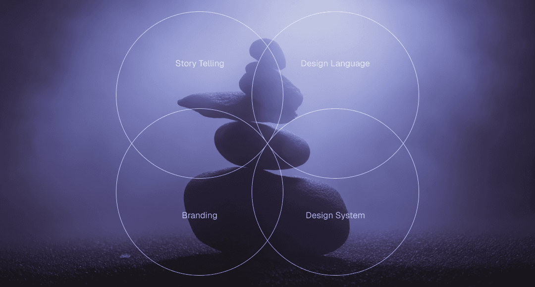
Branding for startups is the first thing you need to tackle. Your social media visuals should feel like they come from the same company, even if they're posted weeks apart.
That means:
Consistent color palette (not every color you've ever liked — 2-3 core colors max)
Consistent typography (one font family, maybe two if you need hierarchy)
Recognizable layout patterns (same structure, different content)
Logo or brand mark in a predictable spot (so people recognize you mid-scroll)
Consistency doesn't mean boring. It means people don't have to relearn who you are every time you post. When someone sees your content in their feed, they should know it's you before they even read the text.
Clarity, hierarchy & readability
Social media is a scroll environment. People aren't there to admire your posts. They're glancing at them while half-paying attention at best.
That means your marketing design needs to do the heavy lifting:
One clear focal point per post (the main idea should be obvious in under 2 seconds)
Big, readable text (if someone has to squint, they'll just keep scrolling)
Visual hierarchy that guides the eye (headline → supporting text → CTA, in that order)
High contrast (especially for text on backgrounds — use WebAIM's contrast checker if you're unsure)
If your design makes people work to understand what you're saying, they won't work. They'll scroll past.
Platform-specific design (without reinventing everything)
Different platforms have different formats, aspect ratios, and audience expectations. But that doesn't mean you need a completely different design system for each one.
What changes by platform:
Aspect ratios (LinkedIn loves 1:1, Instagram stories are 9:16, X handles both)
Tone (LinkedIn skews professional, X skews conversational, Instagram skews visual)
Text density (LinkedIn tolerates more copy, Instagram less so)
What stays the same:
Your brand colors
Your fonts
Your logo placement
Your core visual language
The goal is to feel native to each platform without losing your identity. You're adapting the format, not rebuilding the brand.
How to Design Social Media Posts: A Practical Framework
Most founders approach social media design backwards. They open Canva, stare at a blank canvas, and start moving rectangles around. Then they wonder why it takes an hour to make one post.
Here's a better way how to design for social media.
1. Start with the goal (not the visual)
Before you touch any design tool, answer one question: what is this post supposed to do?
Drive traffic to a blog post?
Announce a product launch?
Share a customer win?
Build thought leadership?
Recruit someone?
The goal determines everything else — the format, the copy, the CTA, the visual treatment. If you don't know what you want someone to do after seeing your post, you're just making content for the sake of content.
2. One idea per post
This is where most people screw up. They try to cram three messages into one graphic because "we're already making a post, might as well..."
No.
One post = one idea. If you have three things to say, make three posts. Or make a carousel. But don't try to communicate multiple concepts in a single static image. It just makes everything cluttered and forgettable.
Do: "We just launched our API"
Don't: "We just launched our API, here's a tutorial, also we're hiring, and check out this customer quote"
3. Visual hierarchy before decoration
Hierarchy is the order your eye travels through the design. Get this right and your post works. Get it wrong and it's just noise.
The hierarchy should be:
Main message (biggest, boldest)
Supporting detail (smaller, but still readable)
CTA or brand mark (present but not competing)
Most amateur designs fail here because everything is fighting for attention. Big headline, big subhead, big logo, big image, big CTA. The result? Nothing stands out.
Pick one thing to emphasize. Make everything else support it.
4. Copy and design as one system
Your visual and your words aren't separate. They're partners.
Good social media design means:
The visual reinforces the message (not just decorating around it)
Text is part of the design (not an afterthought slapped on top)
Copy is tight (if you need a paragraph to explain it, the design isn't working)
The goal: someone should be able to glance at your post and get the point in 2-3 seconds, even if they don't read every word.
Common mistake: Writing a caption, then designing a graphic that says something completely different. Your caption and your visual should tell the same story.
5. CTA discipline
Not every post needs a hard CTA, but every post should have intent.
If you want someone to:
Click a link → make the link obvious (and actually include it in the caption)
Comment → ask a clear question
Share → make it worth sharing (insight, not fluff)
Just build awareness → fine, but be honest that's what you're doing
Don't do: vague CTAs like "What do you think?" when you don't actually care what they think. People can smell low-effort engagement bait.
Templates vs Custom Design: What Actually Scales
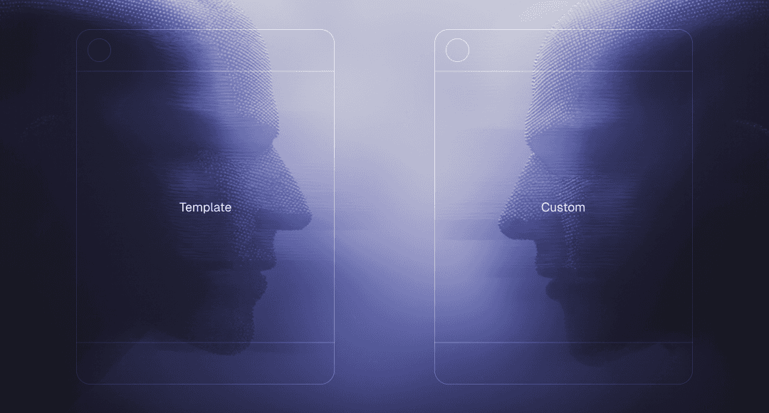
Here's the truth most founders learn the hard way: templates are great until they're not.
When templates are useful
Early on, templates solve a real problem.
They work when:
You're just starting out and need something consistent
You're testing messaging and don't want to invest in custom design yet
You have a small volume of posts (1-2 per week)
Your brand is still evolving
The problem is that most teams treat templates as the permanent solution.
Where templates break down
As your volume increases and your brand matures, the cracks show up fast:
Everything starts to look the same (yours and everyone else's — Canva templates aren't exclusive)
You can't adapt them without breaking the layout (try changing one element and suddenly the whole thing falls apart)
They don't scale with your content needs (the template works for a quote, but not for a product announcement, case study, or carousel)
Your team wastes time hunting for the "right" template instead of just making the post
The real cost isn't the $12/month Canva subscription. It's the hour someone spends every week trying to force-fit content into a template that wasn't designed for it.
Why teams outgrow Canva
Canva is a great tool. But it's built for one-offs, not systems.
As you scale, you hit predictable problems:
No version control (someone edits the "master" template and now it's broken for everyone)
Brand drift (different team members using slightly different colors, fonts, spacing)
No design system (just a folder of disconnected templates)
Slow collaboration (design happens in Canva, feedback happens in Slack, revisions happen in email threads)
This is when founders start Googling "social media design agency" at 11pm because they're tired of being the bottleneck.
What actually scales: social media design systems
Instead of individual social media design templates, you need a system — a set of reusable components and layouts that work together.
A good design system includes:
Brand foundations (colors, fonts, logo usage — locked in and documented)
Layout templates (structures that adapt to different content types)
Component library (buttons, icons, text blocks that snap together)
Asset organization (one source of truth for files, not scattered across Google Drive)
With a real system, creating a post isn't about "finding a template" but assembling pre-designed components in the right configuration. Faster, more consistent, and way less decision fatigue.
This is the shift from making posts to running a system. And it's the difference between social media feeling like a chore and social media just happening in the background.
Common Social Media Design Mistakes Founders Make
Most early-stage teams make the same design mistakes.
Inconsistency across posts
Your LinkedIn looks professional. Your X looks like a different company. Your Instagram looks like it's managed by someone's intern who just discovered gradients.
The fix isn't perfection. It's documentation. Even a one-page brand guide with hex codes, font names, and a few layout examples will save you from this.
Overdesigning (when clarity would work better)
More design doesn't mean better design.
Founders fall into this trap when they think social media posts need to be "impressive." So they add gradients, shadows, multiple fonts, icons, textures, and animations. The result? A cluttered mess that says nothing clearly.
Simple truth: A bold headline on a solid background will outperform a "designed" post 90% of the time. Clarity beats decoration.
No reusable assets
Every post is a blank-slate creative problem. Every announcement requires rethinking layouts. Every product update means starting from scratch.
This is exhausting and slow.
The solution is building a library of reusable elements:
Standard layouts for different content types (announcements, insights, quotes, product updates)
Icon sets
Image treatments (overlays, masks, borders)
Text lockups
Letting design slow down shipping
You have something worth saying. But you can't post it yet because "the graphic isn't ready" or "we need to wait for design feedback" or "I'm not sure about the colors."
So the post sits in draft. For days. Sometimes weeks. And by the time it goes live, the moment has passed.
If design is making you slower, your process is broken.
Good social media design should accelerate your ability to ship, not become a bottleneck. If it's the opposite, you either need better systems or you need to delegate it entirely.
Chasing trends instead of building trust
Someone sees a viral post format and thinks, "we should do that."
So they copy the format. It doesn't perform. They try another trend. That one flops too. Now they're stuck in a cycle of chasing what worked for someone else instead of building something that works for them.
If you have a clear identity and consistent visuals, you don't need to ride every wave. You just show up as yourself, repeatedly, until people recognize and trust you.
Consistency compounds. Trend-chasing doesn't.
DIY, Freelancer, or Agency? How to Choose
At some point, every founder faces this question: should we handle everything on our own or look for some social media graphic design services?
There's no universal answer, but there is a practical one. It depends on your stage, your volume, and what's actually slowing you down.
DIY (Canva / internal team)
When it works:
You're pre-revenue and every dollar counts
You're posting 1-2 times per week max
Someone on your team has decent design taste (not skills, just taste)
You need speed over polish
When it breaks:
Your volume increases (3+ posts per week)
Multiple people are creating content and nothing looks consistent
You're spending more time managing design than actually posting
Your brand needs to look credible for fundraising, partnerships, or enterprise sales
Freelancers
When it works:
You have consistent volume but not enough for a full-time hire
You need someone who can take direction and execute quickly
Budget is tight but you're past the "we'll figure it out" stage
You have a clear brand identity and just need production support
When it breaks:
Context gets lost between projects (they forget your brand guidelines, you have to re-explain things)
Turnaround times don't match your pace (you need a post today, they're booked until next week)
Quality is inconsistent (great one week, off-brand the next)
You're spending too much time managing them instead of letting them run
Agencies / studios
When it works:
You need a full system, not just individual posts
Speed matters and you can't afford to wait for revisions
You want someone who understands your category (SaaS, AI, Web3) and doesn't need hand-holding
You'd rather pay more upfront to avoid managing designers long-term
When it breaks:
You're too early stage and the investment doesn't make sense yet
The agency treats you like a generic client instead of understanding your business
Processes are slow and bureaucratic (endless kickoff calls, revision rounds, approval chains)
They deliver beautiful work that doesn't actually fit how you operate
The right social media design company doesn't just make your posts look good. They build a system that works without you, understand your goals without lengthy briefs, and move at the speed your business actually operates.
How to decide
Ask yourself:
How much time are you spending on social media design right now? If it's more than 2-3 hours per week and you're a founder, that's a problem.
Is your current approach keeping up with your volume? If you're skipping posts because design is a bottleneck, you need help.
Does your social presence match the stage you're at? If you're raising a Series A but your LinkedIn looks pre-seed, fix it.
Can you afford to get this wrong? If credibility is mission-critical (fundraising, hiring, partnerships), don't cheap out.
Social Media Design Trends for 2026
Most “trends” content is just aesthetic bingo. The stuff that actually moves the needle is about how people process content (fast) and why they decide to trust you (rarely rational).
Here’s what the 2026 trend reports consistently point to:
More human, less perfect. Expect “imperfect” visuals (hand-drawn, organic, warm, personal) to keep winning because audiences are tired of polished, samey, AI-looking feeds.
Expressive typography as the hero. Big, exaggerated, playful type and type-led layouts are everywhere in 2026 forecasts, because text-forward creative is easier to scan and works even when images don’t.
Collage + layered compositions (controlled chaos). Multiple elements, stickers, cutouts, mixed media, “maximalist” energy, but structured with hierarchy so it doesn’t become visual noise.
Surreal / playful absurdity (when it supports the message). Surreal, silly, slightly weird visuals show up across forecasts, used as an attention hook, not a personality replacement.
Performance-first ad creative basics aren’t going away. For B2B especially: clarity, relevance, and strong contrast keep showing up in platform guidance and best-practice writeups because they work.
The real meta-trend: teams are moving from one-off “post design ideas” to a social media visual identity built from a reusable asset library (templates, type rules, layout system). That’s how you scale without your feed looking like five different companies.
How We Approach Social Media Design at Tribe
Most teams come to us thinking they need better social media post design. What they actually need is a system that stops social from becoming a time sink.
Our approach to social media design services is simple: design once, reuse intelligently, and never slow the team down.
We don’t treat social as a separate creative playground. It's part of the startup design process we follow in a broader sense. So, it’s an extension of your brand, product, and positioning. That means the same logic that applies to your landing page design, pitch decks, or UI applies here too. Clear hierarchy. Consistent visuals. No guessing.
Instead of cranking out isolated posts, we build a lightweight social media design system:
Reusable layouts for different content types
Defined typography and spacing rules
A small set of flexible social media design templates
A shared asset library your team can actually use
This way, whether it’s a founder posting on LinkedIn, a marketer launching ads, or someone shipping a quick announcement, everything still looks cohesive.
FAQ

What is the 70/20/10 rule for social media?
The 70/20/10 rule is a content distribution framework:
70% value-driven content (education, insights, useful information)
20% shared or curated content (industry news, partners, community)
10% promotional content (your product, service, or CTA)
From a social media design perspective, this rule exists to prevent visual burnout. If every post looks like an ad, people tune out.
What is the 50/30/20 rule for social media?
The 50/30/20 rule focuses more on engagement balance:
50% engaging or entertaining content
30% informative or educational content
20% promotional content
Design-wise, this rule highlights why creative social media post design matters. Engagement-driven posts often need stronger hooks, bolder typography, or more expressive layouts. Educational posts need clarity and hierarchy. Promotional posts need restraint and credibility.
What are the 7 C’s of social media?
The 7 C’s of social media are often defined as:
Clarity – Is the message instantly understandable?
Consistency – Do visuals and tone feel recognizably “you”?
Content – Is the post worth someone’s attention?
Context – Does it make sense for the platform and audience?
Community – Does it invite interaction or conversation?
Credibility – Does it look professional and trustworthy?
Continuity – Does it fit into a bigger system, not a one-off post?
Key Takeaways
Design is a credibility check. People decide whether to trust your brand in seconds. Your visuals are doing that work before anyone reads a word.
Consistency matters more than cleverness. Recognition beats novelty. A familiar look builds trust faster than constantly reinventing your style.
Not every post should look the same. Educational, engaging, and promotional content need different visual intensity. Design should follow intent, not habit.
Systems save time. Teams that move fast don’t design every post from scratch. They reuse layouts, rules, and assets so execution stays easy.
Social shouldn’t feel disconnected. If your posts don’t feel like the same company as your website or product, something’s off. Visual alignment matters.
Templates are a tool, not a solution. They’re useful early on, but long-term quality comes from having your own structure, not borrowing someone else’s.
Good design removes friction. When visuals are clear and predictable, social stops being a mental tax and starts quietly supporting the brand.
Feel like working on social media design assets takes too much time and energy? Get in touch with Tribe and stop thinking about the “hows,” just focus on what you want to post.


