Website design and development
The Ultimate Guide to SaaS Design — UX, UI & Website Strategies That Convert
12 min
Posted on:
Updated on:

written by

Stan Murash
Writer
reviewed by

Yarik Nikolenko
Founder
In SaaS, your design is the experience. There’s no physical product, no sales rep in the room, and often no second chance. Users land on your website, pricing page, or dashboard and make a decision in seconds: Does this feel credible? Do I understand it? Can I trust it with my data, time, or money?
That’s why great SaaS design sits at the intersection of UX, UI, product thinking, and conversion strategy. It influences everything from activation and onboarding to retention, referrals, and revenue. A confusing flow or unclear value proposition doesn’t just “look bad” — it silently kills growth.
If you're a founder or a marketing specialist, this guide won't turn you into a SaaS designer. But it will help you to get a solid understanding of what design should do and what to expect from a good SaaS website design agency (yes, like Tribe). Let's go!
What Is SaaS Design?
SaaS design is the practice of creating user interfaces, experiences, and visual systems specifically for software-as-a-service products. But it's broader than just "SaaS product design." It encompasses everything from your marketing website to your dashboard, from your pricing page to your in-app error messages.
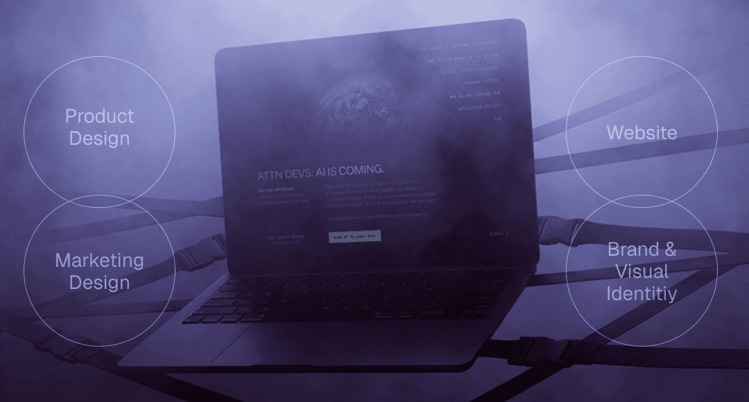
Think of SaaS design as three interconnected layers:
Product design (UI/UX). This is the interface users interact with daily – dashboards, settings, workflows, and data visualization. It needs to be functional, efficient, and intuitive enough that users can accomplish complex tasks without constant hand-holding.
SaaS website design + marketing. Your homepage, landing pages, pricing page, and signup flows. These need to build trust fast, communicate value clearly, and convert visitors into trial users or demo bookings.
Brand and visual identity. The consistent look, feel, and personality across every touchpoint. Colors, typography, tone of voice, and illustration style – all working together to make your product memorable and trustworthy. (If you're a young company, check out our guide on branding for startups to get a solid foundation from the get-go.)
How SaaS design differs from other types of design
SaaS isn't like designing a content site or a consumer app. Here's why:
It's designed for repeated use. Consumer apps optimize for delight and engagement. Marketing sites optimize for conversion. SaaS products optimize for productivity.
It serves multiple user types. You're often designing for end users, admins, and decision-makers simultaneously.
Your design directly impacts revenue. Confusing onboarding? Users churn before they see value. Clunky dashboards? Power users leave for competitors. Unclear pricing page? You lose deals before the sales call. In SaaS, design problems are revenue problems.
When done well, SaaS design doesn’t draw attention to itself. It feels obvious. Clear. Professional. Trustworthy.
And that feeling is often the difference between a product people try once and a product they keep paying for.
Core SaaS Design Principles That Drive Adoption
The products that convert and retain users tend to follow a small set of consistent SaaS UX design principles that reduce friction, build trust, and help users reach value faster.
#1. Clarity over cleverness
In UX design for SaaS, clarity is non-negotiable.
Users don’t want to explore or interpret your interface – they want to understand what the product does and what to do next, immediately. Clever naming, abstract icons, or overly creative layouts often slow users down instead of impressing them.
Strong SaaS design makes the core value obvious:
what the product does,
who it’s for,
and what action matters most.
If a user can’t answer “what is this?” and “what’s my next step?” within seconds, the design is introducing unnecessary friction.
#2. Progressive disclosure reduces overwhelm
Most SaaS products are complex. Good SaaS design hides that complexity until it’s needed.
Progressive disclosure means showing users only what’s relevant at each stage, instead of exposing every feature, setting, or option upfront. This applies to onboarding, dashboards, settings, and even SaaS pricing page design.
By prioritizing core actions and gradually introducing advanced functionality, users feel more confident and less overwhelmed. The product feels approachable first – powerful later.
This principle is critical for improving activation and long-term retention.
#3. Visual hierarchy guides behavior
Visual hierarchy is how SaaS interfaces quietly tell users where to look and what to do.
Through typography, spacing, contrast, and layout, good hierarchy makes primary actions stand out, and secondary actions stay secondary. This is especially important on dashboards, pricing pages, and feature-heavy screens.
Without a clear hierarchy, users hesitate or miss important actions. With it, interfaces feel intuitive, even when they’re dense with information.
In SaaS design, hierarchy is direction.
#4. Performance is part of UX
Speed is a design responsibility.
Heavy visuals, unnecessary animations, and bloated layouts can make SaaS products feel slow and unreliable, even when the backend performs well. Users subconsciously associate sluggish interfaces with poor quality or instability.
Good SaaS application design supports performance by staying lightweight, purposeful, and responsive across devices. Motion is used sparingly, feedback is immediate, and layouts load fast.
A fast product feels trustworthy. A slow one raises doubts.
5. Consistency builds trust over time
SaaS products aren’t used once – they’re used repeatedly. Consistency is what makes repeated use feel effortless.
Consistent components, spacing, terminology, and interaction patterns reduce cognitive load and help users build familiarity. Over time, this creates confidence and speed.
Many early-stage SaaS products break here by shipping features faster than they maintain design coherence. The result is a product that works but feels fragmented.
Strong SaaS design treats consistency as a scaling tool, not a constraint.
#6. Feedback reassures users
Every action in a SaaS product should feel acknowledged.
Feedback – loading states, confirmations, errors, and subtle micro-interactions – tells users that the system is responding. Without it, users hesitate, repeat actions, or assume something is broken.
Clear feedback is especially important in multi-step workflows and background processes common in SaaS tools.
When feedback is handled well, the interface feels alive, reliable, and easy to trust, even when things take time.
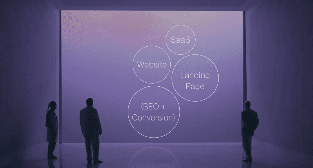
SaaS Websites & SaaS Landing Page Design (SEO + Conversion)
Your product might be brilliant, but if your SaaS landing page design doesn't communicate that in seconds, you've already lost. B2B buyers are skeptical, busy, and evaluating multiple options simultaneously. Your site needs to build credibility fast and make the value proposition crystal clear.
SaaS homepage design structure
A strong web design for SaaS follows a predictable-but-effective structure for a reason: it works.
Above the fold/Hero section: Clear headline that states what you do and for whom. Supporting subhead that explains the core benefit. Primary CTA (Start free trial, Book demo, Get started). Visual that shows your product in context, not abstract illustrations.
Social proof early: Logos of recognizable customers, a testimonial, or a key metric ("Trusted by 5,000+ teams"). Trust needs to be established before users scroll.
Benefits over features: Most homepages jump straight to feature lists. Better approach: lead with outcomes. "Automate your workflow" beats "Advanced API integrations" every time. Show what users can accomplish, then explain how.
Secondary sections: How it works (simplified 3-step process), key features (focus on 3-5, not 20), more detailed social proof (case studies, reviews), final CTA section.
The goal isn't to explain everything – it's to build enough interest that users take the next step.
How to design an effective SaaS pricing page?
Your pricing page is where interest converts to action or dies. Most SaaS companies screw this up by either overcomplicating it or hiding critical information.
Be transparent. Show pricing upfront. If you hide it behind "Contact sales," you're filtering for enterprise only and losing SMB customers who won't bother.
Limit choices. Three tiers are the sweet spot. Any more and decision paralysis kicks in. Name them clearly (Starter, Professional, Enterprise – not confusing metaphors).
Highlight the recommended tier. Most users will pick the middle option if you make it obvious. Use visual emphasis: different color, "Most popular" badge, slightly larger card.
Make feature differences clear. Users shouldn't need a spreadsheet to compare plans. Show what's included at each tier, and use clear language. "Unlimited projects" is better than "Advanced project management functionality."
Reduce friction. Let users start trials without a credit card if possible. Make the signup button obvious. Offer annual billing with a discount prominently displayed.
Signup and conversion UX
Every field in your signup form is a conversion killer. Ask for the absolute minimum: email, password, maybe company name. Everything else can wait until after they're in the product.
Multi-step forms can work if each step feels quick and purposeful. Show progress ("Step 2 of 3"). Never ask the same information twice.
And once they sign up, get them into the product immediately. Welcome emails can wait. Onboarding should start the second they hit your dashboard.
SEO-driven layout and content hierarchy
SaaS websites need to rank for the terms your buyers are actually searching. That means proper heading structure (H1 for your main headline, H2s for major sections), descriptive alt text on images, and fast load times.
Content hierarchy matters for SEO and humans. Organize information logically. Use clear section breaks. Make it easy for Google to understand what each page is about – and easy for users to scan and find what they need.
Trust & Credibility in SaaS Design
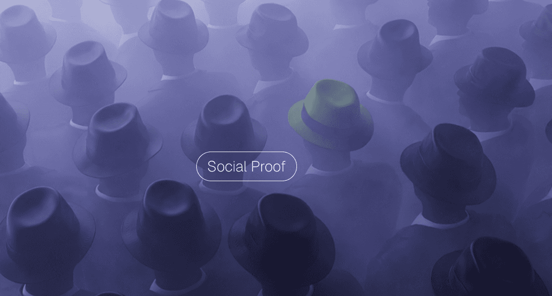
Most users assume your SaaS product is sketchy until you prove otherwise. Especially in B2B, where a bad software decision can cost someone their job.
Trust is built through signals that communicate competence, stability, and social proof.
Social proof patterns that work:
Customer logos from recognizable brands.
Real testimonials with names, faces, and job titles (not anonymous quotes).
Case studies with actual results.
User counts or revenue milestones.
Integration badges (SOC 2, GDPR, ISO certifications).
These aren't vanity metrics, they're risk reducers.
Security and compliance messaging
If you're a B2B SaaS, users care about how you handle their data. Surface this early.
Add a "Security" page.
Show your certifications.
Explain your backup and encryption practices in plain language.
Don't hide compliance information in dense legal docs – make it easily discoverable.
Testimonials and numbers
Specificity builds credibility.
"Increased conversion by 34%" beats "greatly improved results."
Testimonials from named individuals at real companies beat anonymous five-star ratings.
Video testimonials beat text.
Real photos beat stock imagery.
The polish factor
Attention to detail signals that you care. Consistent spacing, thoughtful micro-copy, proper grammar, fast load times – these small things add up. A site that feels polished suggests a product that's well-maintained. Sloppiness anywhere makes users wonder what else you're sloppy about.
In SaaS, credibility is currency. Design like it.
SaaS Product UX (Onboarding → Dashboard)
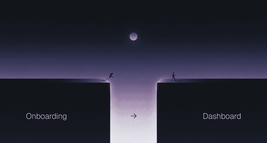
Your marketing site convinced someone to sign up. Congratulations—now the hard part begins. Most SaaS churn happens in the first week, often in the first session. Product UX is where retention is won or lost.
Onboarding UX patterns
Good onboarding gets users to their "aha moment" as quickly as possible. That's the point where they experience real value and understand why your product matters.
Don't explain everything upfront. Nobody reads long tutorial modals. Instead, use contextual guidance: tooltips that appear when users hover over a feature, inline hints that explain what a field does, progress indicators that show how close they are to completion.
Let users learn by doing. Interactive walkthroughs beat passive video tutorials. If your product is project management software, guide users through creating their first project, not through a 10-slide carousel explaining features.
Personalize when possible. Ask a few questions during signup to customize the experience. A designer and a developer need different starting points. Tailor the onboarding to their role or use case.
Celebrate early wins. When users complete their first meaningful action, acknowledge it. A simple "Nice! Your first project is live" reinforces progress and motivates continued use.
Empty states and guidance
Empty states are massively underutilized. When a user first logs in and sees a blank dashboard, that's not dead space—it's prime real estate for guidance.
Show what belongs there and how to add it. Use visuals or illustrations that communicate possibility. Include a clear CTA: "Create your first workflow" or "Import your data." Make the next step obvious.
Dashboards and information density
Dashboards are the home base of most SaaS products. They need to surface the most important information without overwhelming users.
Prioritize ruthlessly. Not every metric needs to be on the main dashboard. Show the 3-5 things users check most often. Everything else can live in dedicated views.
Use progressive disclosure. Summary cards that expand into detailed views. Graphs that drill down into specifics. Give power users depth without cluttering the interface for everyone else.
Design for scanning. Users don't read dashboards—they scan them. Use visual hierarchy, color coding, and clear labels to make information instantly parseable.
In-app help and contextual education
The best products teach users without making them leave the interface. Contextual help icons, inline documentation, and tooltips reduce the need for external support docs.
Link to relevant help articles from within the product. If someone's stuck on a feature, surface a "Learn more" link right there. Don't make them hunt through a knowledge base.
And remember: help shouldn't just be reactive. Proactive nudges ("You haven't set up integrations yet—want help?") can guide users toward features they're missing.
Templates and resources
Here are proven resources for SaaS website design inspiration and work automation.
SaaS-specific UI & pattern libraries
Curated pattern libraries are perfect for inspiration and ensuring you’re following current SaaS interaction trends.
SaaS UI – a curated collection of real SaaS UI screens and interaction designs from top products — perfect for benchmarking and ideation.
SaaSFrame – a growing library of UI screens, landing page designs, pricing pages, dashboards, onboarding flows, and more — excellent for side-by-side comparisons and inspiration.
SaaS Landing Page Inspiration – a massive gallery of 890+ real SaaS landing page designs from established companies, great for studying high-conversion hero sections and layouts.
SaaSPO – curated examples of SaaS landing pages and Web UI designs, ideal for visual idea generation before you start designing.
Dribbble SaaS UX Gallery – a broad collection of SaaS UI/UX shots — perfect for mood-boarding and spotting trending visual styles.
Website templates & no-code builders
When it comes to marketing design for SaaS sites – homepage, features, pricing pages – ready templates get you launched fast.
Framer Free SaaS UI Kit – a 100+ section UI kit for Framer and Figma that lets you rapidly construct a fully responsive SaaS website without coding.
Framer SaaS Website Templates Marketplace – a catalog of SaaS-focused website templates — customizable, conversion-ready, and perfect for agencies or startups.
UX Pilot – AI-generated and customizable website/page templates that can be adapted for SaaS use cases.
FAQ

Who is the best SaaS web design agency?
There's no universal "best" SaaS design agency – it depends on your stage, budget, and what you actually need. Early-stage startups need SaaS design services that move fast, understand product thinking, and won't require months of process. Look for studios with actual SaaS case studies (not just pretty portfolio shots), clear pricing, and a track record of launching sites in weeks, not quarters.
How to design a SaaS product?
Start with the user's job-to-be-done, not a feature list.
Map out core workflows and optimize for the most common paths.
Design onboarding that gets users to value fast – contextual guidance beats long tutorials.
Use progressive disclosure to manage complexity: show basics first, reveal advanced features as needed.
Build in feedback loops so users always know what's happening.
Prioritize performance and responsiveness – lag kills productivity tools.
And test with real users early and often. Your assumptions about what's "intuitive" are probably wrong.
Key Takeaways
SaaS design is infrastructure, not decoration. Your interface is your product, your website is your first sales rep, and your design decisions directly impact activation, retention, and revenue.
It's fundamentally different from other design work. SaaS products are designed for repeated use, serve multiple user types simultaneously, and need to balance simplicity with powerful functionality.
Core principles matter more than trends. Intuitive navigation, progressive disclosure, clear visual hierarchy, fast performance, accessibility, and consistent patterns – these fundamentals separate products users love from ones they tolerate.
Your website needs to build trust fast. B2B buyers are skeptical. Use social proof, show pricing transparently, design clean conversion flows, and make every detail count. Sloppiness anywhere signals sloppiness everywhere.
Onboarding determines retention. Get users to their "aha moment" quickly through contextual guidance, learning by doing, and celebrating early wins. Empty states are opportunities, not dead space.
Design systems create consistency at scale. Reusable components, clear patterns, and documented guidelines ensure your product feels cohesive as it grows.
Speed and quality aren't mutually exclusive. Launch an MVP, gather real user feedback, then iterate. Perfect is the enemy of shipped.
The right design partner moves fast without handholding. Look for agencies with tight processes, real SaaS experience, and the ability to own creative decisions independently.
Feel it's time to get help from a SaaS web design agency? Tribe can help you on all stages, from idea to UI/UX, to brand and marketing design – without slowing you down at any point. Book a fit call to see if it's the match you've been looking for.

