Marketing design
Website design and development
Landing Page Design for Startups 101
8 min
Posted on:
Updated on:

written by

Stan Murash
Writer
reviewed by

Yarik Nikolenko
Founder
Here's something that hasn't changed since the internet became a thing: you have about three seconds to convince someone you're worth their attention. Maybe less if they're doom-scrolling on their phone.
The competition is brutal. There are 150 million startups globally, and most of them have landing pages that look... okay. What's changed in 2026 is that "okay" doesn't cut it anymore.
Your landing page design needs to build trust instantly, communicate value clearly, work flawlessly on mobile, and actually convert.
For Tribe, landing page design services is one of our areas of focus. So, obviously, if you're looking for a design partner, you can stop reading and schedule a call with us. But if you're still indecisive or DYI-ing, do keep reading – we give lots of practical tips that will save you time and headache.
Purpose Shapes Design: Landing Page Design Examples and Types
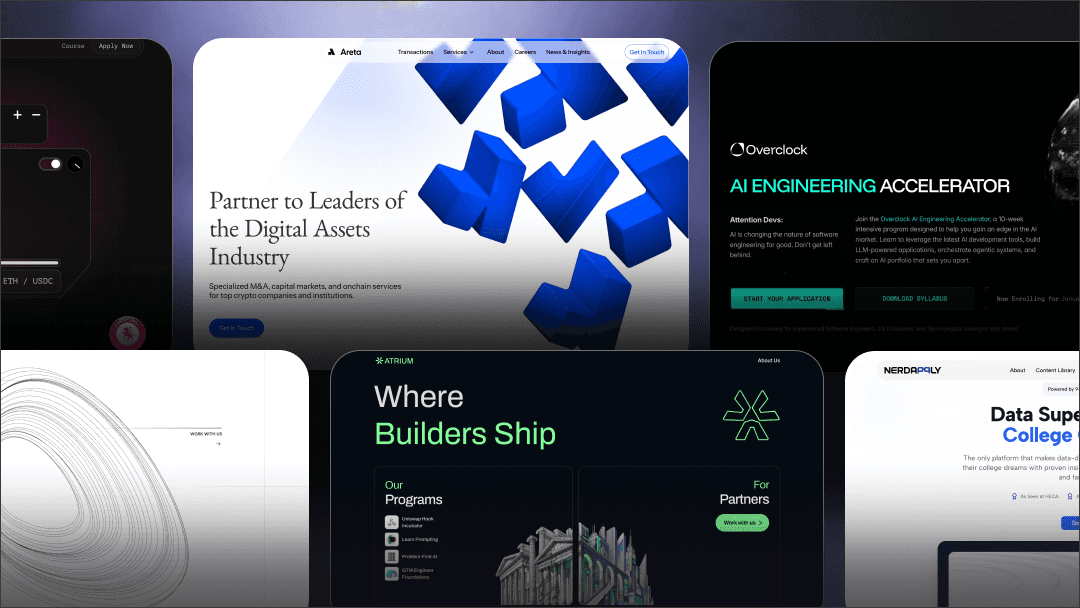
Landing pages are the cornerstone of marketing design. But not all landing pages are created equal. The type you need depends entirely on what you're asking visitors to do. Different goals require different structures, and trying to make one page do everything usually means it does nothing well.
Click-through landing pages are the warm-up. They prep visitors before asking for a big commitment (like starting a trial or making a purchase). Think of them as the bouncer checking IDs before the main event. Light on friction, heavy on benefits.
Lead-generation landing pages have one job: capture contact info. Usually through a form in exchange for something valuable (ebook, demo, waitlist access). The entire page funnels toward that form.
SaaS product landing pages need to do more heavy lifting. They explain the product, show it in action, handle objections, build trust with social proof, and convert visitors into trial users or demo bookings. Multi-section, benefit-focused, conversion-optimized.
E-commerce landing pages are all about the product. High-quality imagery, clear pricing, reviews, and a frictionless path to checkout.
Agency/service landing pages sell expertise and trust. Case studies, process breakdowns, team credibility, and clear CTAs to book a call or request a proposal.
Event/webinar/waitlist pages create urgency. Limited spots, countdown timers, speaker lineups, and a simple signup flow.
Here's the key insight: your goal dictates your layout. Match structure to intent, and everything else gets easier.
Now let's learn how to design a landing page.
Anatomy of a High-Converting Landing Page
So, what are landing page design best practices? Let's go section by section, because the structure works regardless of your industry.
Hero section (above the fold).
This is your three-second test. Visitors should immediately understand what you do and why they should care. You need: a clear headline that communicates value (not just features), a supporting subheadline that adds context, a primary CTA that's impossible to miss, and a visual that shows your product or concept in action.
Value proposition clarity.
Don't make people work to understand what you're offering. State it plainly. "We help X do Y" beats clever wordplay every time. If someone reads your headline and still doesn't get it, you've already lost them.
Benefits vs features.
Features are what your product does. Benefits are what your users get. "AI-powered analytics" is a feature. "Know which marketing channels actually drive revenue" is a benefit. Lead with benefits, support with features. People buy outcomes, not specifications.
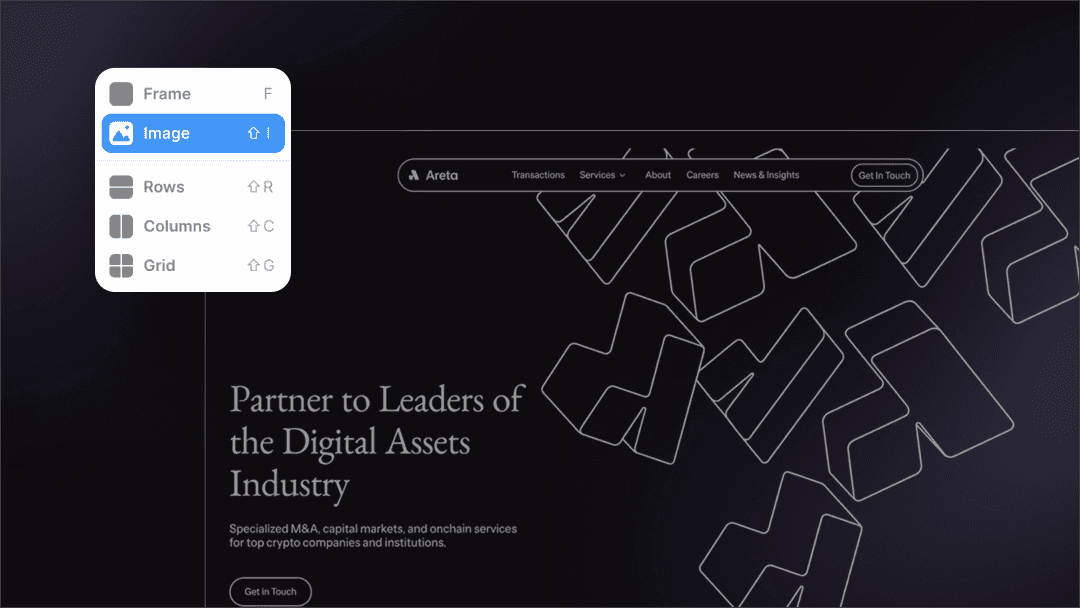
Product visuals.
Show, don't just tell. UI mockups for software, demo videos, explainer graphics – whatever helps people visualize using your product. Real screenshots beat illustrations. Movement beats static images.
Social proof.
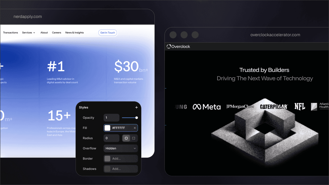
Humans trust other humans. Customer logos (if they're recognizable), testimonials (with real names and faces), usage stats ("trusted by 10,000+ developers"), case study snippets, or press mentions all work. Place them strategically throughout the page, not just dumped at the bottom.
CTAs.
Your primary CTA should appear at least 2-3 times on a long page: hero, mid-page, and footer. Make buttons high-contrast and descriptive.
"Start free trial" beats "Submit." "Book a demo" beats "Learn more."
Lead capture forms.
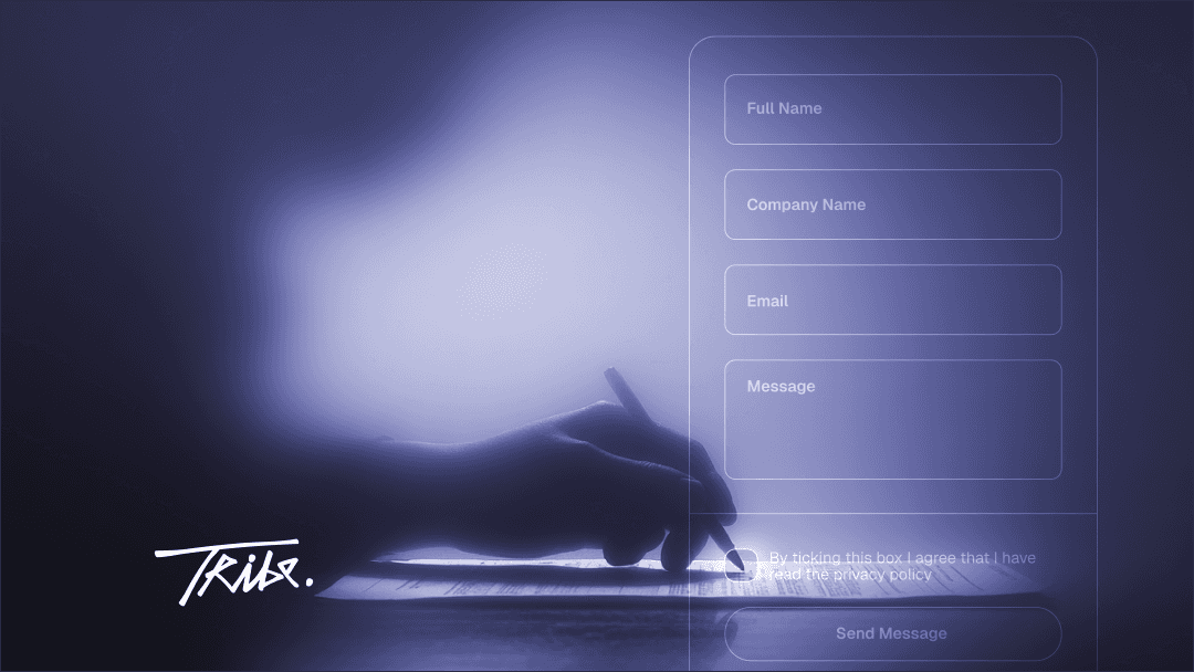
Only ask for what you absolutely need. Every field you add kills conversion. Email alone is often enough. If you need more, explain why.
FAQ & objection handling.
Answer the questions holding people back. Pricing concerns, security, integrations, commitment level – address them before visitors have to email you.
Don't forget that designing a landing page is the next step after you figured out at least the basics of your startups branding. The page needs to look cohesive with your product and any other assets.
Landing Page Design Tips for UX, Performance & Technical Optimization
A beautiful landing page that takes 10 seconds to load is a landing page that nobody sees. Website landing page design and performance aren't separate concerns, they're two sides of the same conversion coin. Although for landing pages the website design and development might be the easiest to tackle, it doesn't mean it comes without issues.
Go for responsive mobile-first design.
Over 60% of web traffic is mobile. Your landing page needs to feel native on every screen size, not just "work" on mobile. That means buttons big enough to tap, readable typography without zooming, logical layout reflows, and images that load fast on slow connections.
Core Web Vitals matter.
Google ranks you on this stuff, but more importantly, users bounce on slow sites.
Aim for: Largest Contentful Paint under 2.5 seconds, First Input Delay under 100ms, and Cumulative Layout Shift under 0.1.
Use PageSpeed Insights to check your scores.
How to decrease loading speed?
Compress images (use WebP format),
lazy load anything below the fold,
minimize JavaScript bloat,
use a CDN for static assets,
optimize your hosting.
Every extra second of load time costs you conversions.
Follow accessibility guidelines.
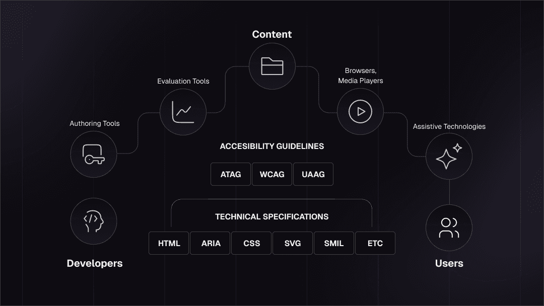
Check W3.org website to learn more.
Design for everyone.
Use sufficient color contrast (WCAG AA minimum).
provide alt text for images,
ensure keyboard navigation works,
create logical heading hierarchy,
test with screen readers.
Accessibility isn't just ethical, it's good UX for everyone.
Follow usability heuristics.
Visual hierarchy guides the eye. Use whitespace to create breathing room. Make scannability easy with short paragraphs, bullet points where appropriate, and clear section breaks. Don't make users hunt for information or guess what to do next.
The fastest way to kill conversions isn't “ugly” landing page web design – it's slow, broken, or inaccessible design. If you feel it's your case, unfortunately, it might be time for a thorough website redesign.
Copywriting & Psychology: Design for Human Behavior
Creative landing page design might get people to look. But a good copy gets them to act. So, the effective landing page design is the one who gets how and why people function.
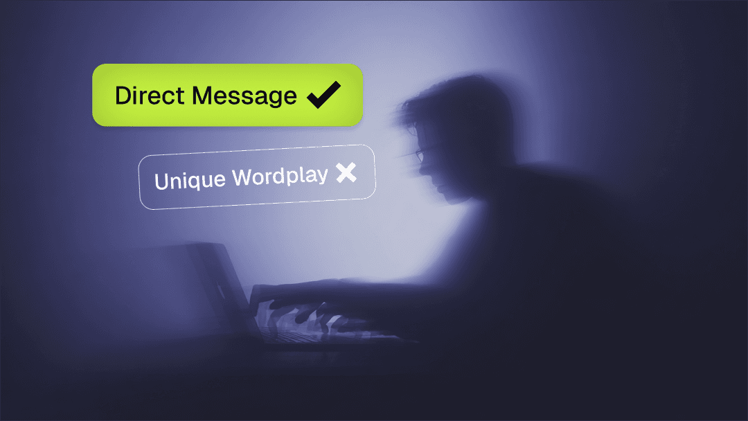
Benefit-driven headlines. Start with the outcome, not the process. "Ship code 10x faster" beats "Advanced AI-powered development tools." People don't care about your technology until they understand what it does for them.
Clarity beats cleverness. Witty wordplay might win awards, but it rarely converts. If someone has to re-read your headline to understand what you do, you've lost them. Be direct, be specific, be clear.
Trust signals and risk reduction. People are skeptical by default. Counter this with: "No credit card required," "Cancel anytime," "14-day money-back guarantee," security badges, privacy commitments, and real customer testimonials. Lower the perceived risk of trying your product.
Persuasion levers. Urgency ("Limited spots available"), scarcity ("Only 50 beta invites left"), social proof ("Join 10,000+ users"), and authority ("Featured in TechCrunch") all work – but only when they're genuine. Fake urgency destroys trust faster than anything.
CTA microcopy impact. The words on your buttons matter more than you think. "Start building for free" is more compelling than "Sign up." "Get my personalized demo" beats "Request demo." Make it specific, value-focused, and low-friction.
Landing Page Design Trends 2026
Trends come and go, so you don't have to try and chase each and every. But some actually improve conversion and user experience. Here are some trends a good landing page design company might follow.
AI-assisted personalization. Dynamic content blocks that change based on visitor behavior, location, or referral source. Show different hero copy to users coming from Product Hunt vs a paid ad.
Video micro-demos instead of static mockups. Short (10-15 second), auto-playing product demos that show your UI in action beat static screenshots. Users want to see the product move. Keep it tight, keep it focused, and make sure it loads fast.
Minimalist layouts with strong typography. The maximalist, everything-everywhere-all-at-once approach is dying. Clean layouts with bold headlines, generous whitespace, and deliberate visual hierarchy are winning. Let your value prop breathe.
"Trust-first" design for AI/crypto/web3/SaaS products. In spaces where skepticism is high, transparency is currency. Show your team, explain your tech without buzzwords, link to documentation, display real customer logos, and be upfront about pricing. Users in technical spaces can smell BS from a mile away.
Split-screen hero layouts. Half product visual, half value prop. Works especially well for SaaS landing page design where showing the interface is as important as explaining what it does.
Motion: subtle micro-interactions, not distracting animations. Hover states that feel responsive, smooth scroll effects, elements that fade in as you scroll – these add polish without slowing things down. But skip the parallax effects that make users nauseous and kill mobile performance.
The best trend? Focusing on conversion over decoration. Use what works, skip what doesn't, and always test with real users. If you don't know where to start, check our guide on startup design process.
Optimization & Testing: After Launch Steps
When you design landing page, its launch is only the starting point. The beautiful thing about landing pages is that they get smarter the longer they’re alive, if you actually listen to what your users are doing.
Here’s the post-launch playbook that keeps conversions climbing instead of flatlining:
Watch the numbers that matter.
You don’t need 40 dashboards. Just track:
Conversion rate (your north star)
Scroll depth (where people drop off)
Click heatmaps (what they’re actually trying to interact with)
Form abandonment (your silent killer)
Run small tests, not full redesigns.
A/B test the headline.
Then the hero visual.
Then the CTA.
Tiny changes → big impact.
Most founders try to overhaul everything at once and learn nothing.
Fix friction ruthlessly.
If mobile bounce is high, your layout’s broken.
If people scroll but don’t click, your CTA sucks.
If nobody reaches your FAQ, it’s in the wrong spot.
Everything users do is a signal — follow the clues.
Iterate every 2–4 weeks.
Landing pages are not “set and forget.” They’re living assets. Update, refine, tighten, repeat. Your product evolves. Your story evolves. Your landing page should evolve right alongside it.
Free Resources, Tools & Templates
If you don't have the finances or the will to give yourself over to some landing page design service, here are some resources you as a founder or marketing specialist can use to DYI.
Figma Templates
Figma Landing Page Design Templates — free designs from the Figma community
Landing page design templates from Figma community
310+ Landing pages collection
FigmaFreebie – 459+ free landing page design files (UI kits, blocks, full page concepts)
No-Code Builders
Everyone knows Webflow and Framer, but here’s the fuller ecosystem — each with a different “speed vs control” sweet spot:
Polished + powerful
Framer — fastest to publish; best for polished SaaS/product pages
Webflow — CMS-friendly, flexible, widely supported
Ridiculously fast / solo-founder-friendly
Typedream — clean, simple, “Notion for landing pages”
Dorik — underrated, fast, includes templates that don’t suck
For mobile apps / startup MVPs
For teams that want built-in analytics & experiments
Unbounce — pricey, but A/B testing is elite
For developer-first companies
Vercel + Next.js templates (if you want custom but still fast)
Bonus tip: If your designer wants to do something fancy, and your dev wants to cry — use Framer.
Landing page design inspiration
Let’s expand beyond the usual suspects like Dribble.
Mobbin for web patterns
godly.website — inspiration for motion & micro-interactions
Pro tip: don’t copy designs. Copy patterns.
Key Takeaways
If there’s one truth about landing pages in 2026, it’s this: the bar is higher, the competition is louder, and attention spans are shorter than ever.
But the formula for a winning page hasn’t changed.
Clarity beats everything. If your value prop isn’t instantly obvious, nothing else matters.
Design for trust. Social proof, clean visuals, real screenshots, transparent messaging.
Show the product early. Movement wins. Micro-demos beat static images.
Make it stupidly fast. Speed is conversion. Slow pages silently kill growth.
Mobile-first isn’t optional. Most of your traffic is on a phone. Act like it.
Use psychology intentionally. Benefits > features, proof > promises, specifics > fluff.
Test constantly. Small A/B tests outperform big redesigns.
Update your page as your product evolves. Landing pages aren’t launch assets — they’re living ones.
Don't have time and patience for DYI? Get in touch with us at Tribe and get your landing page designed in no time — and with no compromises on quality.

