Branding for startups
Startup Logo Design: How To Look Legit Before You Raise A Dollar
9 min
Posted on:
Updated on:

written by

Stan Murash
Writer
reviewed by

Yarik Nikolenko
Founder
Most early-stage founders overthink their startup logo design.
They try to be clever. Symbolic. Deep.
They want hidden meaning. Easter eggs. Geometry that only makes sense after a Medium article explaining it.
Meanwhile, investors glance at it for 3 seconds. Users see it in a tiny browser tab. And your first 1,000 visitors mostly just want to know: “Is this legit?”
Startup logo design isn’t art direction for a global brand. It’s a credibility shortcut. Especially in AI, Web3, fintech, and SaaS — where trust is fragile and scams are common.
At Tribe, we’ve worked with early-stage founders building grant-backed Web3 programs, AI tools, and SaaS platforms. The pattern is always the same: the logo isn’t about standing out — it’s about not looking amateur.
Let’s break down how to get it right.
Key Takeaways
A startup logo design is a credibility tool — not a creative experiment.
Clarity beats clever symbolism every time.
If your logo fails at 24px, it fails in real-world use.
It must work on dark mode, light mode, and in grayscale.
Redesigning too early usually signals impatience, not progress.
A logo without a supporting brand system creates long-term inconsistency.
Momentum and stability beat constant visual reinvention.
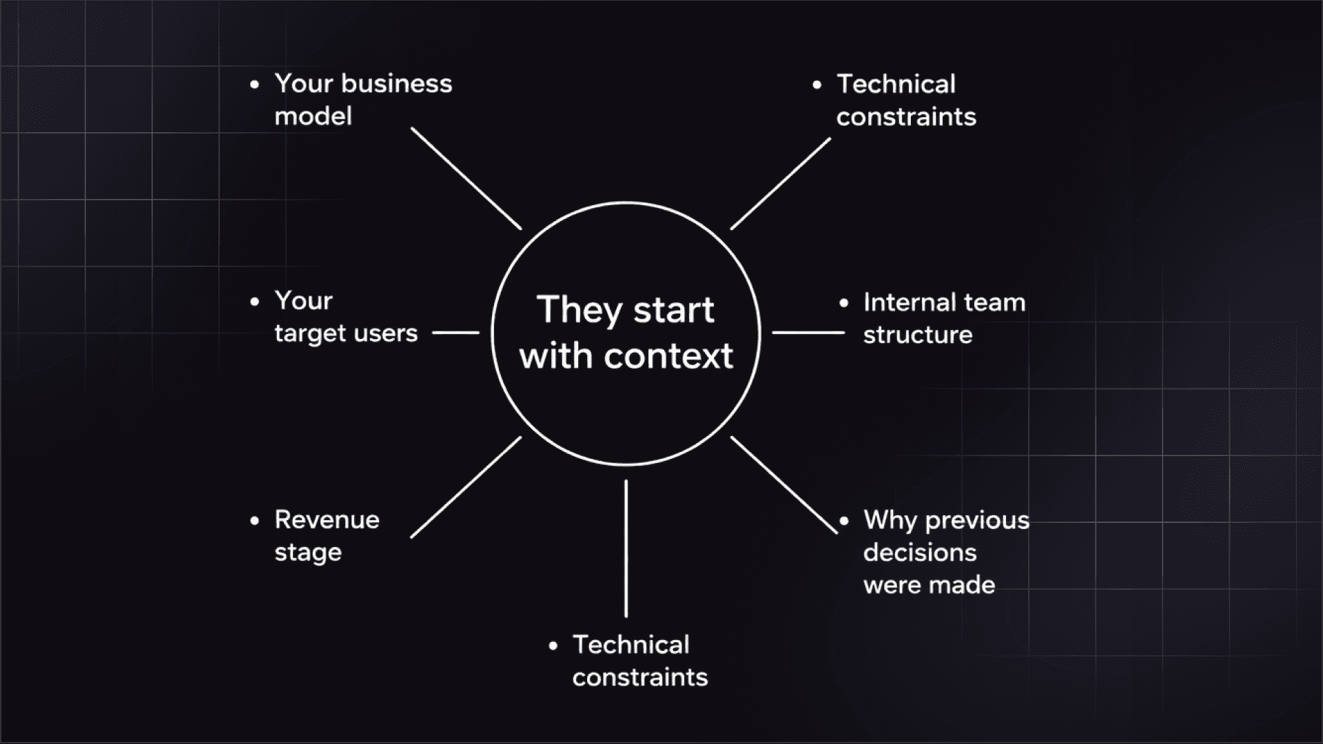
What Startup Logo Design Is (And What It Is Not)
Startup logo design gets misunderstood because founders give it too much weight — and the wrong kind.
It’s either treated as a magic lever (“Once we fix the logo, everything improves”) or as a purely aesthetic decision (“Just make it look cool”).
Both are wrong.
A startup logo is a functional business asset. It supports perception. It does not replace strategy.
A logo is not your brand
Your brand is positioning, narrative, tone, market category, and user experience.
Your logo is a visual identifier.
That’s it.
If your messaging is unclear, your logo won’t save you.
If your product positioning is weak, your icon won’t fix it.
We go deeper into this distinction in our guide to branding for startups, but here’s the short version: branding is strategic; logo design is structural.
Treating them as the same thing is how founders waste time debating shapes instead of clarifying positioning.
A logo is a credibility shortcut
What a startup logo does do is accelerate trust.
In AI, Web3, fintech, and SaaS, users are constantly evaluating risk:
Is this secure?
Is this serious?
Is this built by professionals?
Your logo is one of the first visual signals in that equation.
It won’t make you famous.
It won’t make you viral.
But it can remove friction.
And at early stage, reducing friction is more valuable than looking “creative.”
Why Most Early-Stage Startup Logos Fail
Startup logo design rarely fails because of lack of talent.
It fails because of misplaced priorities.
Founders obsess over symbolism, ignore application, and redesign before the business even has traction. The result? A logo that feels expensive — but fragile.
They optimize for cleverness
Early-stage teams love meaning.
The hidden “S” inside a lightning bolt.
The infinity symbol representing scalability.
The abstract geometry that “tells a story.”
Here’s the uncomfortable truth: nobody cares.
Investors won’t decode it.
Users won’t analyze it.
Partners won’t ask about the symbolism.
If your logo needs explanation, it’s already failing.
Clarity beats originality — especially at pre-seed.
A simple, confident wordmark often outperforms an overengineered icon. Not because it’s boring, but because it removes friction.
They ignore real-world application
A logo does not live in a Figma frame.
It lives:
In a 16px favicon
In your website header
On a dark-mode dashboard
On a pitch deck slide
In social avatars
If it breaks when scaled down, it’s weak.
If it only works on white backgrounds, it’s unfinished.
This is where logo design directly intersects with your site structure and layout. When founders think about how identity integrates into real product environments, it changes decisions. Our breakdown of website design and development for startups explains how visual elements actually behave across live pages.
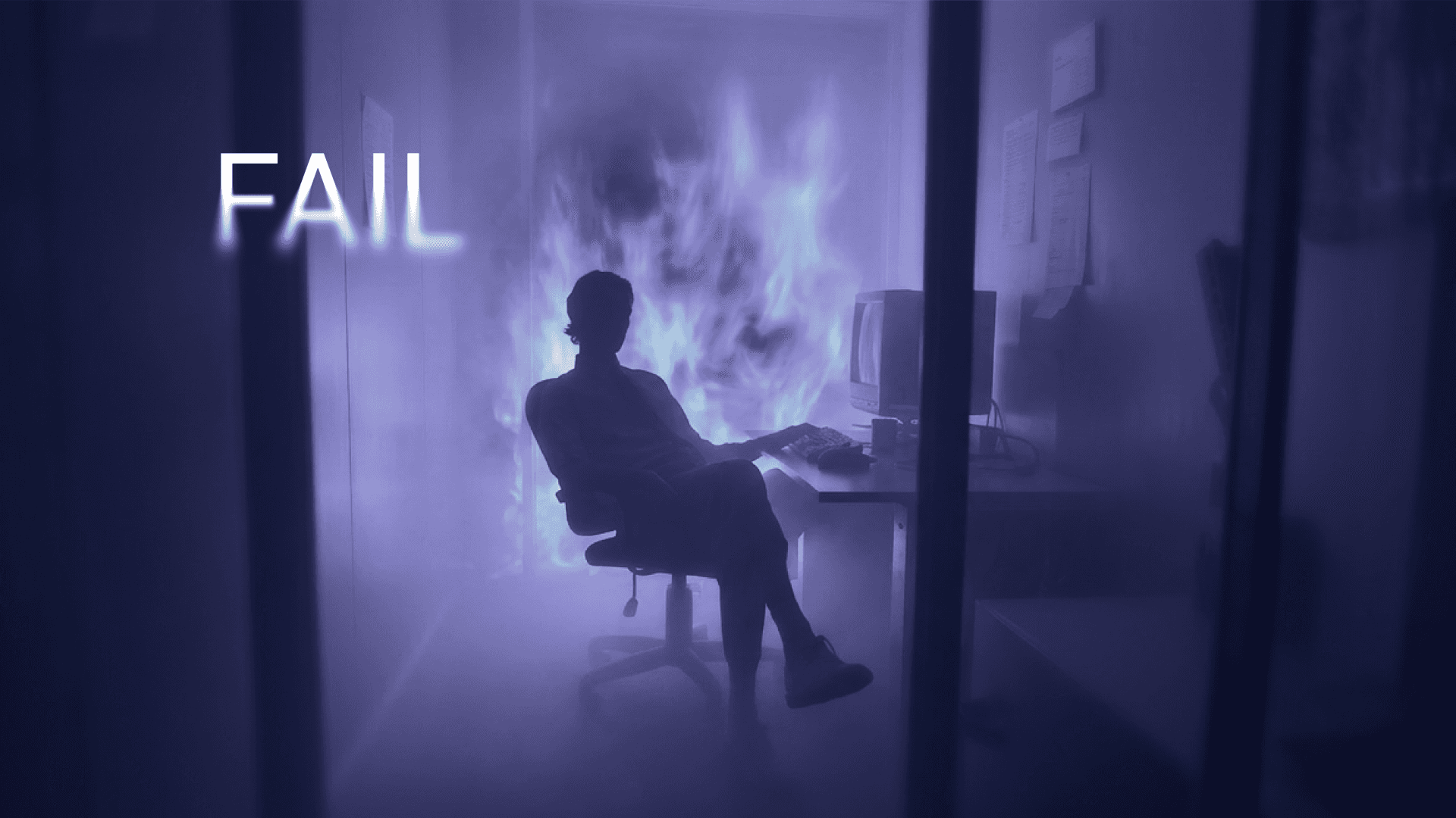
They redesign too soon
This one is subtle — and expensive.
Three months after launch: “We’ve evolved.”
Six months in: new direction.
Twelve months: rebrand.
If you don’t have traction yet, your logo isn’t the bottleneck.
Momentum compounds. Constant redesign resets it.
A stable, credible logo that lasts 2–3 years is better than three “improved” versions in one.
The 5 Rules Of Effective Startup Logo Design
If you remember nothing else from this article, remember this:
Startup logo design is about durability.
Not taste. Not trends. Not clever metaphors.
Durability.
A logo that works for 2–3 years while you grow is infinitely more valuable than a logo that feels exciting for three months.
Here are the five rules that prevent expensive regret.
Rule 1 — Clarity beats originality
Originality is overrated at early stage.
Clarity is not.
When someone sees your logo for the first time, their brain runs a quick scan:
Does this look legitimate?
Does this feel modern?
Does this match the category?
That’s it.
They’re not evaluating artistic depth.
Founders often try to encode mission, vision, disruption, decentralization, AI intelligence, and scalability into a single mark. The result is complexity that doesn’t scale.
A strong wordmark with thoughtful typography often wins. Clean. Confident. Unapologetic.
If you can simplify — simplify.
If you can remove a symbol — remove it.
Rule 2 — It must work small
This rule eliminates half of bad startup logos instantly.
Shrink your logo to 24px.
Does it survive?
Test it as:
A browser favicon
A GitHub avatar
A Slack workspace icon
A mobile app icon
If it turns into noise, it’s too detailed.
Startup brands live in tight UI spaces. Your logo competes with product UI, not billboard space.
If you’re designing for Dribbble instead of real interfaces, you’re solving the wrong problem.
Rule 3 — It must survive on dark and light
Modern startups increasingly ship dark-mode products.
If your logo only works on white backgrounds, you’re building fragility into your identity.
A strong startup logo design must:
Work on white
Work on black
Work in grayscale
Work without gradients
Gradients are not identity.
They’re decoration.
Decoration can change. Identity shouldn’t collapse when it does.
When founders think system-first — not aesthetic-first — their visual decisions improve dramatically. That’s why we emphasize structured thinking in the startup design process guide.
Rule 4 — It should match your market’s trust expectations
Every category has invisible visual rules.
AI developer tooling?
Minimal. Technical. Structured.
Fintech compliance?
Conservative. Controlled. Institutional.
Web3 infrastructure?
Modern. Slightly futuristic. But not chaotic.
If you go wildly against category expectations at early stage, you risk looking unserious.
Later — once you have traction — you can bend rules.
Before that? Fit first. Differentiate second.
This doesn’t mean copying competitors. It means understanding the visual language of trust inside your space.
Rule 5 — It must scale into a system
Your logo is not a floating object.
It sits inside:
Website layouts
Product dashboards
Social graphics
Pitch decks
Email headers
If your logo doesn’t translate into typography choices, spacing logic, and color systems, you’ll feel inconsistency within months.
And inconsistency erodes credibility.
This is where startup logo design connects directly to broader branding decisions. As we explain in our branding for startups guide, identity isn’t about one mark — it’s about repeatable structure.
A logo without a light brand system is a ticking redesign.
Build for scale from day one — even if you’re still small.
Should You DIY, Hire A Freelancer, Or Work With A Startup Design Agency?
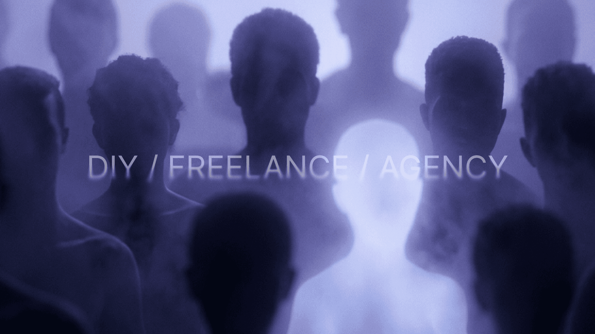
Not every startup needs an agency.
But every startup needs to make a conscious decision.
Logo design sits at an awkward intersection: it’s visible enough to matter, but early-stage budgets are tight. The right choice depends on where you are — not on what feels “professional.”
DIY (Canva, AI tools)
If you’re pre-MVP or still validating, DIY is fine.
Tools are better than ever. You can generate clean wordmarks, experiment with typography, and get something usable in hours.
The upside:
Fast
Cheap
Zero coordination overhead
The downside:
No brand system
Generic results
Hard to scale visually
DIY works for validation. It rarely works for growth.
Freelancer
Freelancers can be a strong middle ground.
You’ll likely get something more custom than a template and more refined than AI output.
But here’s the risk: many freelancers design logos in isolation.
They optimize for visual appeal — not long-term brand structure. Without broader thinking around typography, spacing, and system logic, you’ll eventually feel inconsistencies across website and marketing assets.
Startup design agency
An agency makes sense when:
You’re preparing to raise
You’re launching publicly
You need to look institutional
You need repeatable brand structure
At that point, startup logo design becomes part of a broader identity system — not a standalone deliverable.
That’s when investing in structured branding services starts to make strategic sense.
How Startup Logo Design Fits Into The Bigger Brand System
Your logo does not exist in isolation.
It lives inside structure.
The moment your startup ships publicly, your logo touches:
Website navigation
Product onboarding
Dashboard UI
Pitch decks
Social media graphics
Email signatures
If the logo feels disconnected from typography, layout, and color decisions, everything starts to look slightly off. Not broken — just inconsistent.
And inconsistency quietly erodes trust.
This is why startup logo design cannot be separated from broader brand logic. The mark itself might be simple, but it must anchor a repeatable system: type hierarchy, spacing rhythm, color behavior, and UI application.
We explore this more deeply in our guide to the startup design process, where design is treated as structured thinking — not isolated deliverables.
It also directly affects how your identity translates into live environments. When your logo integrates cleanly into headers, footers, and product layouts, your site feels intentional. Our breakdown of website design and development for startups shows how brand systems show up in real interfaces.
Startup logo design is the entry point.
System thinking is what makes it sustainable.
Startup Logo Design Mistakes In AI, SaaS, And Web3
Different startup categories fail in different ways.
The mistake isn’t always bad design — it’s misaligned design.
What looks “cool” in one industry can quietly damage trust in another.
AI
AI startups often lean too hard into futuristic clichés.
Glowing gradients.
Brain icons.
Neural network dot clusters.
Overly abstract geometry.
The result? Interchangeable branding.
Most AI companies are selling precision, intelligence, and reliability. But visually, many communicate sci-fi experimentation instead of competence.
Clean typography and restraint usually signal maturity better than visual noise.
Web3
Web3 startups frequently swing toward hype aesthetics.
Neon palettes.
Aggressive typography.
Token-launch energy.
If you’re building infrastructure, developer tooling, or compliance platforms, that tone can backfire.
Trust in Web3 is already fragile. Over-indexing on “crypto vibes” instead of credibility can make you look short-term.
Modern and slightly futuristic? Yes.
Chaotic and loud? Rarely helpful.
SaaS
SaaS founders often go too safe.
Minimal sans-serif wordmark.
Soft blue palette.
Predictable structure.
It’s clean — but indistinguishable.
You want category alignment — not invisibility.
EdTech
EdTech startups often drift toward either childish or overly academic.
Playful mascots can undermine credibility for career-focused programs.
On the other extreme, hyper-corporate visuals can feel cold and unapproachable.
Education involves money, trust, and life decisions.
Your logo should communicate clarity and authority — without feeling intimidating.
Balance matters more than flair.
FAQ
How much should startup logo design cost?
For very early-stage startups, you can spend close to zero using DIY tools — and that’s fine during validation.
Once you’re preparing to raise, launch publicly, or onboard serious customers, expect to invest anywhere from a few thousand dollars upward — especially if the logo is part of a broader brand system.
The mistake isn’t spending too little.
It’s spending on a logo without investing in structure.
When should a startup redesign its logo?
Redesign when:
Your positioning changes significantly
You move upmarket
Your current identity actively hurts credibility
Don’t redesign because you’re bored. And don’t redesign to “create momentum.” If you don’t have traction yet, your logo likely isn’t the bottleneck.
Can AI generate a good startup logo?
AI can generate a usable starting point.
It cannot build you a durable brand system with typography rules, spacing logic, and application standards.
Use AI for speed. Don’t expect it to replace strategic thinking.
What files should I receive from a designer?
At minimum:
Vector files (SVG, AI, or EPS)
Transparent PNG versions
Light and dark versions
Favicon-ready version
Ideally, you should also receive basic usage guidelines so your team doesn’t distort or misuse the mark.
Is a logo enough for early-stage branding?
No.
A logo without typography, layout rules, and consistent application becomes inconsistent fast.
Startup logo design is the entry point.
Brand structure is what makes it durable.
To sum up
Startup logo design is simple — if you approach it with the right objective.
You’re not trying to win a design award.
You’re trying to remove doubt.
A credible, durable logo gives your startup stability while everything else evolves — product, messaging, pricing, positioning. It becomes a visual constant while you test and grow.
If you’re launching soon — or feeling like your current logo quietly undermines your credibility — it might be worth pressure-testing it before you scale traffic or start pitching harder. Book a fit call and let us take logo worries off your hands.

