Website design and development
Design for EdTech: A Practical Guide for Startup Founders
10 min
Posted on:
Updated on:
written by

Stan Murash
Writer

Yarik Nikolenko
Founder
reviewed by
Designing an EdTech product looks straightforward at first.
There’s onboarding. A dashboard. Progress tracking. User flows. Structurally, it resembles most SaaS tools.
The difference shows up when real learners start using it.
In typical SaaS products, users want momentum. They’re trying to complete tasks, move metrics, ship outcomes. Speed and clarity matter most.
Education products operate in a more personal space. Users are building competence. They’re testing themselves. Sometimes they’re doubting whether they’re “getting it.” The interface isn’t just supporting action — it’s shaping confidence.
That shift changes how design decisions land.
From working with education-driven teams at Tribe, we’ve seen how small UI choices can either lower cognitive load or quietly increase anxiety. And when learning feels heavy, engagement drops fast.
Let’s break down what actually changes when you design for education — and why it requires a different mindset from day one.
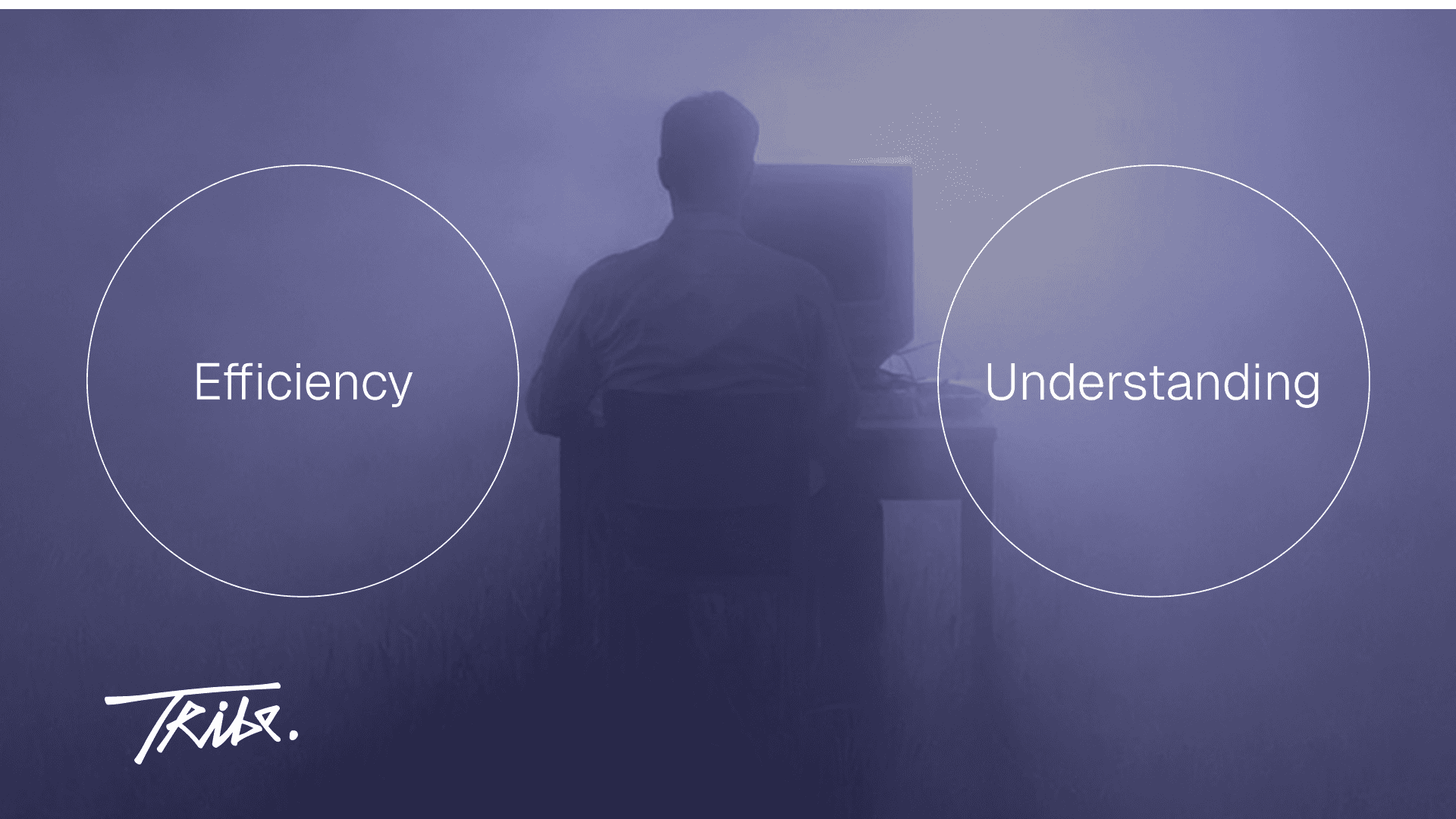
Regular SaaS Optimizes Efficiency. EdTech Optimizes Understanding.
Most SaaS products are built around momentum.
A user logs in with a goal: send the invoice, deploy the feature, publish the campaign. The interface is there to reduce friction between intention and completion. Fewer clicks. Clear dashboards. Obvious CTAs. Progress equals finishing the task.
Education products operate on a different timeline.
The goal isn’t completion — it’s comprehension.
A learner can technically “finish” a lesson without understanding it. They can click through modules and still feel lost. So design has to support something less visible than task completion: mental processing.
That changes priorities.
In productivity SaaS, you often compress information. In EdTech, you pace it.
In SaaS design, clarity means speed. In learning, clarity means structure.
Hierarchy becomes more deliberate. Spacing becomes instructional. Microcopy carries more weight because it guides interpretation, not just action.
This is where many founders miscalculate. They apply a fast-moving startup UI mindset to a context that demands cognitive breathing room.
If you’re building an education-driven product, this is less about trendy UI patterns and more about understanding how people absorb information.
Once the goal shifts from “get it done” to “help them get it,” everything downstream — tone, layout, feedback — evolves with it.
Emotional Context Is Completely Different
In most SaaS tools, stress is operational.
Users are thinking about time, money, output. They want to move faster. If something is confusing, it’s annoying — but rarely personal.
In education products, the emotional layer runs deeper.
People are dealing with grades, career transitions, skill gaps, sometimes even identity. A developer learning a new framework may question their competence. A student preparing for exams may already feel overwhelmed before logging in.
That emotional backdrop changes how design is perceived.
Dense dashboards can feel intimidating. Aggressive copy can feel patronizing. Overloaded interfaces increase pressure instead of productivity.
Design, in this context, becomes a stabilizer.
Color palettes often lean calmer. Layouts need clearer structure. Feedback should feel constructive rather than evaluative. Even small details — how you display mistakes, how you word quiz results, how you surface progress — influence whether users feel encouraged or exposed.
This is where UX research basics matter more than aesthetics. Understanding user anxiety, motivation triggers, and drop-off patterns is foundational. If you’re building a learning product, investing time in research — not just visual polish — makes a measurable difference.
Because when learning feels psychologically safe, engagement grows.
When it feels stressful, people churn quietly.
Tone And Visual Style Need Restraint
Visual intensity that works in SaaS can backfire in education.
Bold gradients. Oversized headlines. Aggressive “win big” messaging. Hard-driving CTAs. In productivity tools, that energy reinforces ambition and speed.
In learning environments, it can feel noisy.
Education products benefit from visual stability. Calm color systems. Predictable layout patterns. Clear typographic hierarchy. The goal isn’t to excite users every time they log in — it’s to help them focus.
Trust plays a bigger role here too.
If your platform teaches developers, prepares students for exams, or helps professionals upskill, the visual tone signals credibility. When things feel overly salesy or trend-chasing, users question seriousness. That hesitation slows adoption.
This doesn’t mean EdTech has to look dull.
It means energy is applied intentionally — to highlight progress, celebrate milestones, or guide attention. Not to create constant stimulation.
Founders often underestimate how strongly tone shapes perception. The visual system communicates whether the product respects the learner’s time and intelligence.
And in education, respect builds retention faster than hype.
Complexity Of Information Changes Everything
A lot of SaaS products revolve around workflows.
Click this. Configure that. Move to the next step. The logic is procedural. Users follow a path and the system responds.
Education platforms deal with concepts.
Concepts aren’t linear. They build on each other. They require context, examples, reinforcement, and sometimes repetition. That shifts the role of design from guiding actions to supporting cognition.
Information density becomes a strategic decision.
Too little structure, and learners feel lost.
Too much at once, and they feel overwhelmed.
Design has to manage pacing.
Whitespace isn’t aesthetic — it gives the brain room to process.
Section breaks signal mental shifts.
Typography creates hierarchy between definitions, explanations, examples, and exercises.
Even progress indicators work differently. In SaaS, progress usually means “almost done.” In learning, progress reflects growing competence. The UI needs to reflect that development in a way that feels meaningful.
This is where thoughtful UX research becomes practical, not theoretical. Understanding how learners move through content — where they pause, rewind, drop off — informs layout decisions and information architecture. We touch on these foundations in our breakdown of lean UX research.
When you’re designing for EdTech, you’re shaping how people think — not just how they click.
That responsibility shows up in every structural choice.
In EdTech, Content Is The Product
In many SaaS tools, the interface is the product.
Dashboards, automations, integrations — the value lives in the system itself. The cleaner and faster the interface, the stronger the product feels.
In education platforms, the core value often lives in the content.
Lessons. Explanations. Exercises. Feedback. Examples.
If that material is hard to scan, poorly structured, or visually exhausting, the entire experience suffers — even if the UI is technically solid.
Typography becomes strategic. Line length affects comprehension. Contrast influences reading stamina. Spacing shapes how digestible information feels.
Content blocks need rhythm. Concepts need visual distinction from summaries. Exercises need to feel interactive without being distracting.
This is where founders sometimes overinvest in UI polish and underinvest in instructional clarity.
A slick dashboard won’t compensate for dense, intimidating lesson pages.
Design for EdTech requires respecting the reading experience as much as the interaction flow. The layout has to support understanding first — aesthetics follow.
Because when the content carries the value, the interface’s job is to make thinking easier.
Trust Runs Deeper In Education Products
Trust exists in every product.
In SaaS, it usually revolves around reliability. Does the tool work? Is the data safe? Is uptime consistent?
In education, trust carries more weight.
Users are investing time, money, and belief. Sometimes they’re trusting you with their career path. Sometimes with their academic performance. In certain cases, parents are trusting you with their children’s learning.
That changes how design mistakes are interpreted.
A confusing analytics dashboard in a marketing tool is frustrating.
A confusing grading system in an education product feels serious.
Visual consistency becomes reassurance. Clear feedback becomes accountability. Even error states need to feel thoughtful, not abrupt.
Credibility signals matter more too. Instructor visibility. Structured course overviews. Transparent progress metrics. Predictable navigation. All of it contributes to a sense of stability.
This is where brand and product design intersect closely. If the visual identity feels careless or overly experimental, confidence drops. We explore that credibility layer more deeply in our guide to branding for startups.
Because in learning environments, design isn’t just about usability.
It quietly answers the question: “Can I trust this to guide my growth?”
Progress And Feedback Are Motivation Engines
In productivity tools, progress is usually binary.
You sent the invoice. You closed the ticket. You hit the metric.
Completion equals success.
In education products, progress unfolds over time. Improvement can be gradual and sometimes invisible to the learner. That’s why feedback design becomes central.
If users can’t see growth, they assume there isn’t any.
Scores, streaks, completion rates, skill levels — these mechanics aren’t decorative. They reinforce effort. They signal forward movement. They help learners connect daily activity with long-term development.
But the way you present them matters.
Overemphasize scoring and the experience feels evaluative. Underemphasize feedback and motivation fades. The balance sits somewhere in the middle: clear indicators of advancement, framed as growth rather than judgment.
Microcopy plays a role here too. “Incorrect” lands differently than “Not quite — try again.” Small tonal shifts influence persistence.
Designing these systems requires thinking beyond UI patterns and into behavioral psychology. What keeps someone returning for week three? What helps them recover after a bad quiz result?
This is where structured design thinking and workflow clarity matter. We discuss how founders can approach these systems methodically in our guide to the startup design process.
Because in EdTech, motivation isn’t automatic. It’s designed.
EdTech Is Built For Long Cycles
Most SaaS products deliver value quickly.
You sign up, set things up, and start seeing results within days — sometimes minutes. The feedback loop is short and reinforcing.
Education products operate across longer arcs.
Courses run for weeks. Certifications span months. Skill development stretches across entire semesters. That means the design must sustain engagement without overwhelming or boring the user.
Visual fatigue becomes a real risk.
If every lesson looks identical, motivation drops. If every screen is visually intense, users burn out. Rhythm matters — variation in layout, milestone moments, periodic reinforcement.
Long-term engagement also depends on predictable structure. Learners should know where they are, what’s next, and how far they’ve come.
Design for EdTech has to think beyond the first session.
It has to support the fifteenth.
Multiple User Roles Complicate Everything
Many SaaS tools serve one primary user.
Maybe there’s an admin layer, but the core experience is focused. One dashboard. One workflow. One goal.
Education platforms often operate in multi-role environments.
Learners.
Teachers.
Parents.
Administrators.
Each group has different expectations, permissions, and emotional stakes.
A learner needs clarity and motivation. A teacher needs oversight and insight. A parent might want reassurance and visibility. An admin looks for control and reporting.
Design systems must accommodate all of them without becoming chaotic.
Navigation needs to shift based on role. Data visibility needs careful boundaries. Dashboards must surface different metrics without feeling like entirely separate products.
This is where structural discipline matters. If roles aren’t clearly defined early, the product grows messy fast. Information architecture decisions compound over time.
Founders building in this space should think through role logic as part of early UX planning — not as a patch later.
Because in EdTech, you’re rarely designing for just one user.
You’re designing for an ecosystem.
The Risk Of Over-Gamification
Gamification shows up frequently in EdTech — points, badges, streaks, leaderboards.
Used well, it reinforces consistency. It makes effort visible. It creates small wins that compound into habits.
Used poorly, it trivializes the experience.
If everything feels like a game, serious learners disengage. Professionals upskilling for career growth don’t want cartoonish reward systems. Parents evaluating a platform for their kids don’t want shallow mechanics replacing real instruction.
On the other hand, removing motivational cues entirely can make the product feel flat and transactional.
The balance is subtle.
Gamification should amplify learning, not distract from it. Rewards should highlight mastery, not just activity. Visual cues should feel integrated into the experience — not layered on top.
Design for EdTech requires restraint here too.
Motivation works best when it feels earned.
Frequently Asked Questions
What is design for EdTech?
Design for EdTech refers to creating digital learning products that prioritize comprehension, motivation, and long-term engagement. It goes beyond usability and focuses on cognitive load, emotional safety, instructional clarity, and visible progress.
How is EdTech design different from SaaS design?
SaaS design typically optimizes for speed and task completion. EdTech design supports understanding and skill development over time. That shift influences layout structure, feedback systems, tone, pacing, and how progress is displayed.
What are the biggest mistakes EdTech founders make?
Common mistakes include copying SaaS UI patterns without adapting them for learning contexts, overloading lesson pages with dense information, relying too heavily on gamification, and underestimating the emotional side of learning.
Does EdTech need gamification?
Gamification can help reinforce consistency and motivation, but it must support mastery rather than distract from it. Points and badges work best when they highlight real progress instead of superficial activity.
How do you design trust into an education platform?
Trust is built through clarity, consistency, and transparency. Structured course overviews, visible progress tracking, predictable navigation, and credible visual identity all contribute to a stable and reassuring experience.
Key Takeaways
EdTech vs SaaS at a Glance
Dimension | Regular SaaS | EdTech |
|---|---|---|
Core goal | Complete tasks | Build understanding |
Emotional context | Operational pressure | Personal growth & self-doubt |
Interface priority | Speed & efficiency | Clarity & cognitive pacing |
Success signal | Task done | Skill improved |
Time horizon | Short feedback cycles | Weeks, months, semesters |
Content role | Supports workflow | Often the core product |
Gamification | Rare | Common — but must be balanced |
Designing for EdTech means optimizing for comprehension and confidence — not just task completion.
Emotional context matters more in learning platforms; anxiety and self-doubt shape how users experience your UI.
Content structure and readability often carry more weight than flashy interface elements.
Trust signals in EdTech go deeper — users are investing in outcomes, not convenience.
Visible progress systems sustain motivation across long learning cycles.
Multi-role complexity requires disciplined information architecture from day one.
Gamification should reinforce mastery, not replace meaningful learning.
Design for EdTech requires a different lens.
If you’re building in EdTech and want a second set of eyes on your product direction, design system, or learning UX — book a fit call.

