Branding for startups
Design For Web3: How To Build Trust In A Skeptical Market
8 min
Posted on:
Updated on:

written by

Stan Murash
Writer
reviewed by

Yarik Nikolenko
Founder
Web3 has a trust problem.
Scams. Rug pulls. Anonymous founders. Overdesigned landing pages promising “revolutionary ecosystems.” Users have learned to be skeptical — fast.
That means design for Web3 isn’t decoration. It’s risk mitigation.
Your brand, product UI, and website aren’t just marketing assets. They’re signals. Signals that you’re serious. That you’re secure. That you’re not another weekend token experiment.
Most crypto projects over-index on aesthetics — gradients, motion, dark mode everything — and underinvest in clarity and structure.
From working with Web3 and AI founders at Tribe, we’ve seen one thing repeatedly: in crypto, credibility compounds faster than hype ever will.
Let’s break down what that actually means in practice.
Why Web3 Design Is Different
Web3 isn’t just another SaaS vertical. It operates in a higher-trust, higher-risk environment.
Trust deficit is real
In most industries, users assume legitimacy until proven otherwise. In crypto, it’s the opposite. People assume risk first.
Wallet drains. Phishing links. Smart contract exploits.
If your product looks even slightly chaotic or unclear, users hesitate. And hesitation kills conversion.
Design in Web3 has to reduce perceived risk instantly — through structure, clarity, and visual maturity.
Security perception matters
You can’t visually “prove” your code is secure.
But you can design signals that imply seriousness:
Clean information hierarchy
Clear documentation access
Transparent team presence
Thoughtful UI states around transactions
When someone connects a wallet, that moment carries psychological weight. Your design either reassures — or amplifies fear.
Developers are often your first audience
Many Web3 startups sell to developers first.
Devs don’t care about shiny animations. They care about clarity, documentation, fast onboarding, and zero fluff.
This is where product UX and brand meet. If your landing page screams marketing while your docs are buried, you lose them.
This connects directly to how we approach the startup design process — structure before styling, clarity before polish.
Grants and ecosystem politics
Unlike typical startups, many Web3 projects are:
Grant-funded
Ecosystem-backed
Community-evaluated
Your design is being judged not just by users, but by protocol teams, DAO voters, and ecosystem partners.
It needs to look independent — but aligned. Experimental — but not reckless.
That balancing act is unique to Web3.
Branding For Web3 Startups
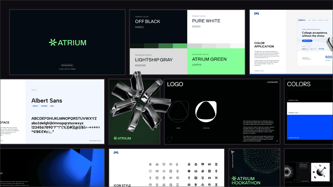
Branding in Web3 isn’t about being loud. It’s about being believable.
If you haven’t read our deeper breakdown on branding for startups, the short version is this: early-stage brand exists to create credibility — not vibes.
In crypto, that rule gets amplified.
Avoid crypto cliché aesthetics
Neon gradients. Glitch typography. Abstract 3D blobs floating in dark mode.
It worked in 2021 when speculation was hot.
Today? It screams “temporary.”
Your brand should feel durable. Structured. Intentional.
Ask yourself: would this still look serious in five years?
If the answer is no, you’re designing for X — not longevity.
Build institutional credibility
Even if you’re a three-person team, your brand should feel bigger than you.
That means:
Consistent typography and spacing
Mature color palette (less rainbow, more restraint)
Clear positioning language
Minimal buzzwords
Web3 is full of overpromising. Your brand should underpromise visually and overdeliver through clarity.
For a practical framework, a strong brand identity checklist (positioning, tone, visual rules) will take you further than chasing aesthetic trends.
Make complexity feel understandable
Web3 products are inherently complex — tokens, governance, staking, audits, smart contracts.
Your brand’s job isn’t to simplify the product. It’s to make complexity feel navigable.
That happens through:
Strong visual hierarchy
Clear diagrams
Clean layout systems
Consistent component patterns
If your ecosystem landing pages feel chaotic, users assume your protocol is chaotic.
Brand structure signals operational structure.
And in Web3, operational structure equals trust.
Web3 UX: Clarity Over Cleverness
In Web3, UX mistakes aren’t just annoying.
They’re expensive.
A confusing flow in SaaS might cost you a signup. A confusing flow in crypto might cost someone real money.
That changes the stakes.
Reduce cognitive overload
Most Web3 products suffer from “too much context.”
Wallet addresses. Gas fees. Network switches. Token approvals. Governance layers.
If everything looks equally important, nothing feels safe.
Good Web3 UX does three things:
Shows only what’s necessary at each step
Explains consequences clearly
Uses visual hierarchy to guide decisions
Clarity first. Then aesthetics.
Onboarding flows matter more in crypto
In Web3, onboarding often includes:
Wallet connection
Network selection
Permission approval
Transaction signing
Each of these is a psychological friction point.
Your job isn’t to remove friction entirely. It’s to frame it.
Explain what’s happening. Show progress. Reassure users visually. Use consistent patterns.
When the UI looks stable, users feel safer clicking “Confirm.”
Wallet interactions need trust signals
Wallet modals are one of the highest-anxiety moments in crypto UX.
Design around them:
Use clear CTA labeling
Avoid vague “Continue” buttons
Highlight what users are approving
Reinforce security language near actions
If your transaction flow feels rushed or vague, it amplifies fear.
And fear kills retention.
Transparency beats persuasion
Web3 audiences are allergic to marketing speak.
Instead of pushing users, inform them.
Show documentation clearly. Link audits visibly. Surface token mechanics in plain language.
The website layer matters too. Your product UX and marketing UX must align — something we discuss in our website design and development guide.
If your site promises simplicity but your app feels chaotic, trust breaks instantly.
In Web3 UX, coherence equals credibility.
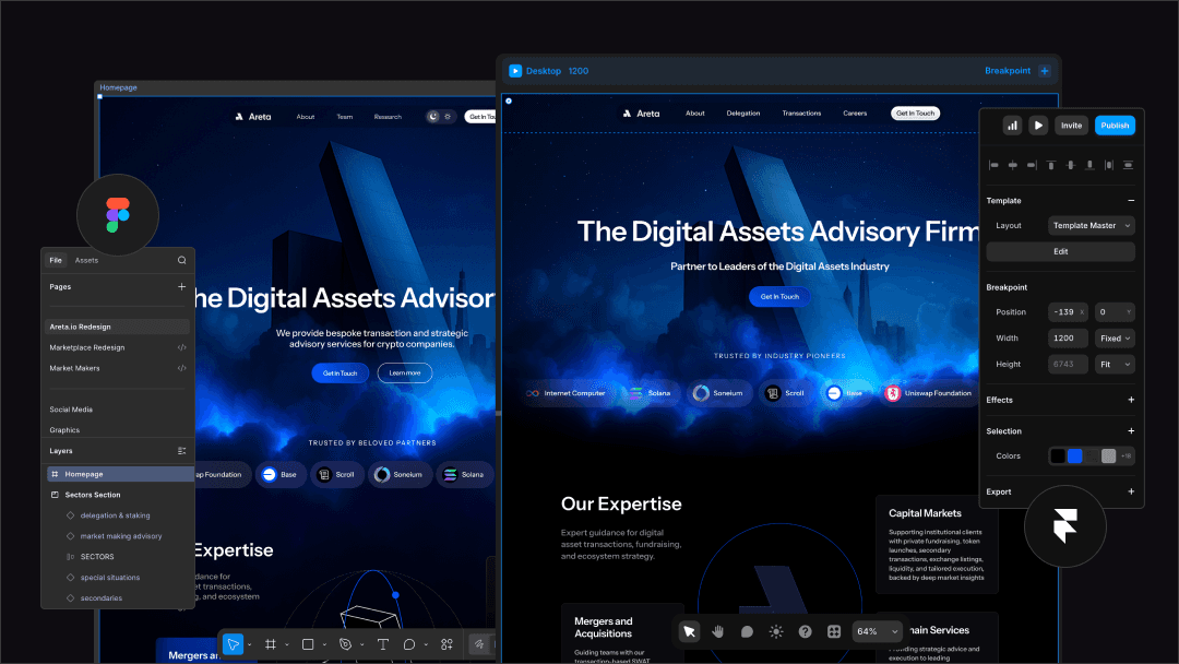
Website Design For Web3 Projects
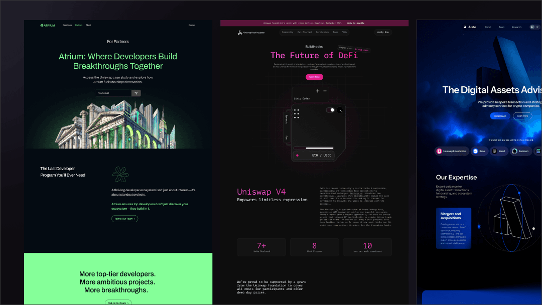
Your website in Web3 does more than explain your product.
It signals whether you’re safe to interact with.
Dev-first vs investor-first messaging
Many Web3 teams struggle here.
Are you building for:
Developers integrating your protocol?
Retail users staking tokens?
Ecosystem partners?
Investors?
Your above-the-fold section must reflect your real priority audience.
If you’re dev-first, lead with:
Clear technical positioning
Documentation access
Architecture clarity
If you’re user-first, lead with:
Use case
Security signals
Social proof
Trying to speak to everyone at once makes you credible to no one.
Ecosystem landing pages need structure
Web3 projects often launch:
Chain-specific versions
Grant-backed programs
Ecosystem partnerships
Each of those needs its own landing page.
But here’s the mistake: founders redesign each one from scratch.
Instead, build a repeatable system:
Consistent layout structure
Swappable ecosystem branding
Modular content blocks
Reusable visual components
This reduces chaos and increases perceived maturity.
Token vs product positioning
If you have a token, your homepage should not revolve around price action.
Lead with product utility.
Explain:
What the product does
Who it’s for
Why it’s secure
How the token fits into the system
Speculation fades. Utility sustains.
If your website feels like a trading page instead of a product company, long-term trust erodes.
In Web3, your website isn’t decoration.
It’s your first audit.
Common Web3 Design Mistakes
Most Web3 design problems aren’t technical.
They’re judgment errors.
Looking like a scam unintentionally
You don’t have to be malicious to look sketchy.
Red flags include:
Overpromising headlines
Anonymous team pages with no context
Excessive animations on financial actions
Aggressive “connect wallet” prompts
In a space already saturated with bad actors, small visual signals matter. If your UI feels chaotic, users assume your operations are too.
Overusing dark themes and motion
Yes, crypto culture loves dark mode.
No, that doesn’t mean everything should glow.
Overuse of:
Neon gradients
Glassmorphism
Parallax motion
Floating 3D assets
…can make your product feel like a demo instead of infrastructure.
Restraint reads as maturity.
Maturity reads as trust.
No clear value proposition
Many Web3 sites describe mechanisms instead of outcomes.
“Decentralized liquidity layer powered by modular primitives.”
Cool.
But what does it actually do?
If users can’t understand the benefit in 5–7 seconds, they bounce.
Clarity is a competitive advantage in Web3.
Designing for social media — not users
If your homepage is optimized for screenshots instead of usability, you’re building a marketing asset — not a product interface.
Design for:
Users executing transactions
Developers integrating APIs
Partners evaluating legitimacy
Not for engagement metrics.
In Web3, attention is cheap.
Trust is not.
When To Invest In Design For Web3
Most Web3 founders wait too long.
They ship fast (good), duct-tape the visuals (fine), then realize credibility is lagging behind traction.
Here’s when design becomes non-negotiable.
Before a grant application
Ecosystem teams don’t just evaluate your idea. They evaluate your execution maturity.
If your deck, landing page, or product mockups look chaotic, it signals operational risk.
Design increases perceived seriousness — which matters in DAO votes and grant reviews.
Before token launch
A token launch amplifies scrutiny.
You don’t want your first large wave of traffic landing on something that feels experimental.
This is when brand, website structure, and UX polish need to align.
Before launching a marketplace or infrastructure product
If you’re facilitating transactions between parties (audits, liquidity, tools, staking), your design becomes part of the trust layer.
People won’t transact through something that feels unstable.
Before fundraising
Investors in Web3 look for signal.
Clear positioning. Clean interface. Structured storytelling.
Good design won’t replace traction.
But it can multiply how your traction is perceived.
In Web3, perception compounds.
FAQ

What makes design for Web3 different from SaaS?
Web3 operates in a high-risk environment. Users assume skepticism first. That means design must reduce perceived financial and security risk immediately — through clarity, structure, and transparency — not just aesthetics.
Should Web3 startups always use dark themes?
No. Dark mode became popular in crypto culture, but it’s not mandatory. Overusing neon gradients and heavy motion can make your product feel speculative instead of stable. Restraint often signals maturity.
What matters more in Web3 — branding or UX?
They work together. Branding builds first-impression trust. UX sustains it during wallet connections, transactions, and onboarding. If one feels polished and the other chaotic, credibility breaks.
When should a Web3 startup hire a design agency?
Before high-scrutiny moments — grant applications, token launches, marketplace rollouts, or fundraising. Those are inflection points where perception compounds.
How much does Web3 design typically cost?
It varies based on scope — brand system, product UX, website, or all three. Early-stage teams often start lean, focusing on credibility-critical surfaces first, then expanding as traction grows.
Key Takeaways
Web3 design is a trust mechanism — not an aesthetic experiment.
Credibility compounds faster than hype in crypto markets.
Clear UX reduces perceived financial risk during wallet interactions.
Branding in Web3 should feel durable, not trendy.
Your website is often your first security signal.
Developers value clarity and structure over visual flair.
Ecosystem grants and token launches amplify design scrutiny.
In Web3, restraint signals maturity — and maturity builds trust.
And as always — if this sparked something and you want to pressure-test your own Web3 positioning: book a fit call.

